View methods side by side.
Choose up to four methods. Add them using the search and share the comparison by copying its link.
| Criterion | 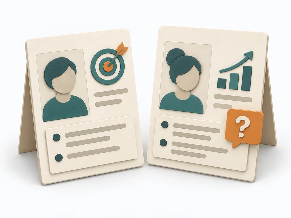 UX Research Personas | 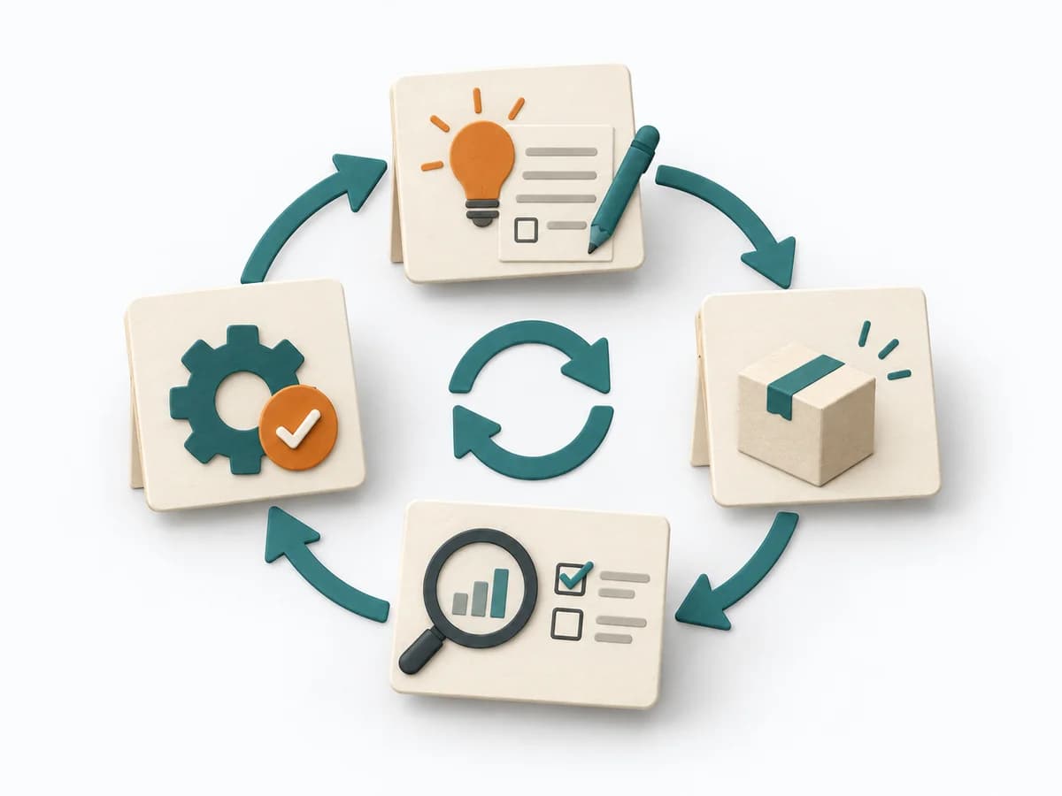 Operations PDCA Cycle | 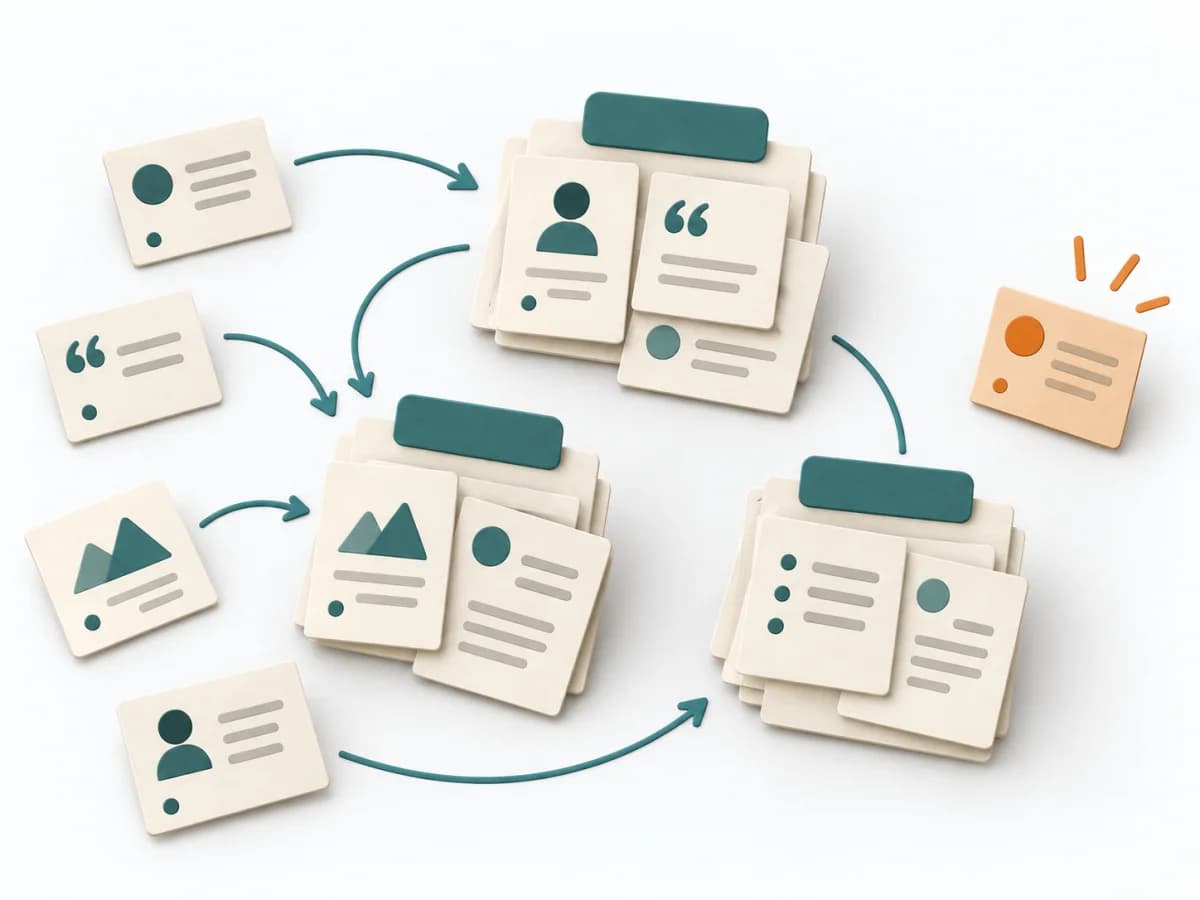 UX Research Affinity Diagramming |
|---|---|---|---|
Purposedifferent | When target groups stay too vague and teams talk about the same people differently, personas create a shared, solid picture of usage. Condensed profiles make needs, contexts, and differences tangible enough for decisions. | For an improvement that still has to prove itself in everyday work, the method runs it through small learning loops. It connects planning, checking, and standardization into a repeatable learning mode. | When research notes, feedback, or observations sit unconnected side by side, affinity diagramming sorts the raw material into solid themes. Many individual points turn into patterns that make decisions and opportunities clearer. |
Complexitydifferent | Medium | Low | Low |
Timedifferent | 1-3 Tage | 1 h bis mehrere Wochen | 45–90 min |
Participantsdifferent | Internes Team | 1-8 | 3-10 |
Formatdifferent | Workshop + async | Workshop + async | Workshop |
Outputdifferent | Persona Profiles, Needs Summary, Scenario Notes | PDCA Log, Experiment Plan, Learning Outcome, Standard Change | Theme clusters, Insight statements, Opportunity areas |
Tagsno overlap | ResearchCustomerSynthesis | Continuous improvementLeanExperiments | SynthesisQualitativeRoot cause |
Often compared together
Methods with strong topical overlap with the current selection, not yet in the comparison.