View methods side by side.
Choose up to four methods. Add them using the search and share the comparison by copying its link.
| Criterion | 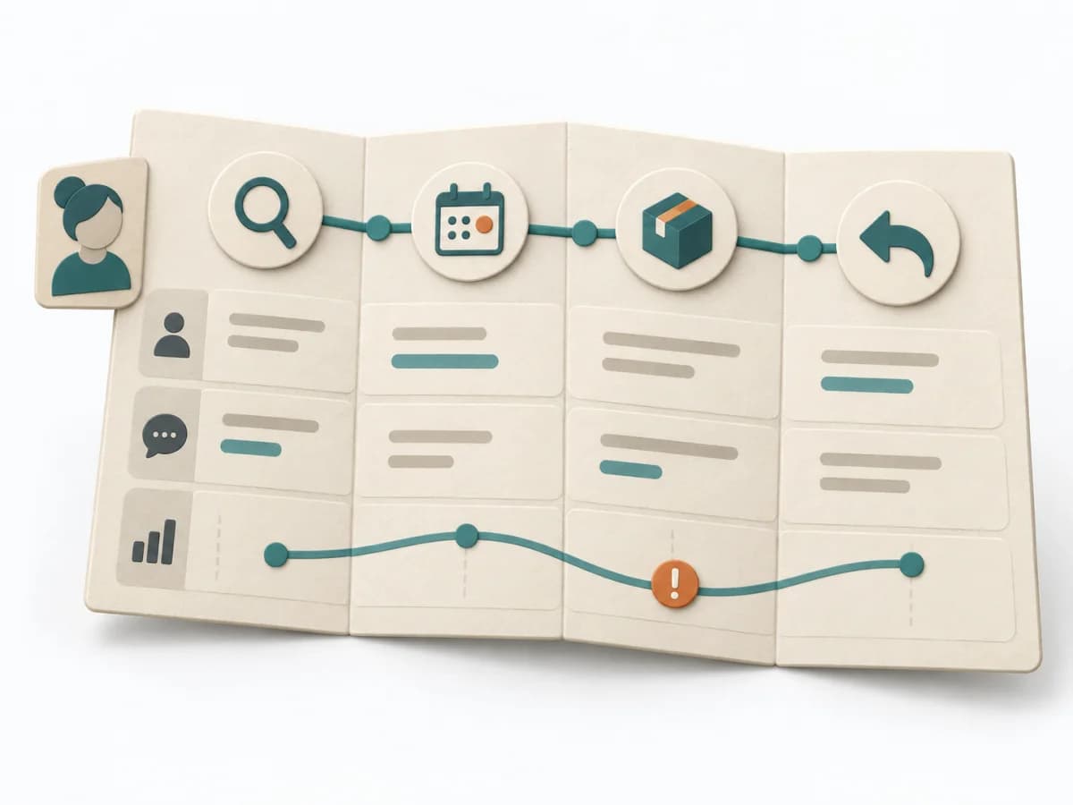 UX Research Customer Journey Mapping | 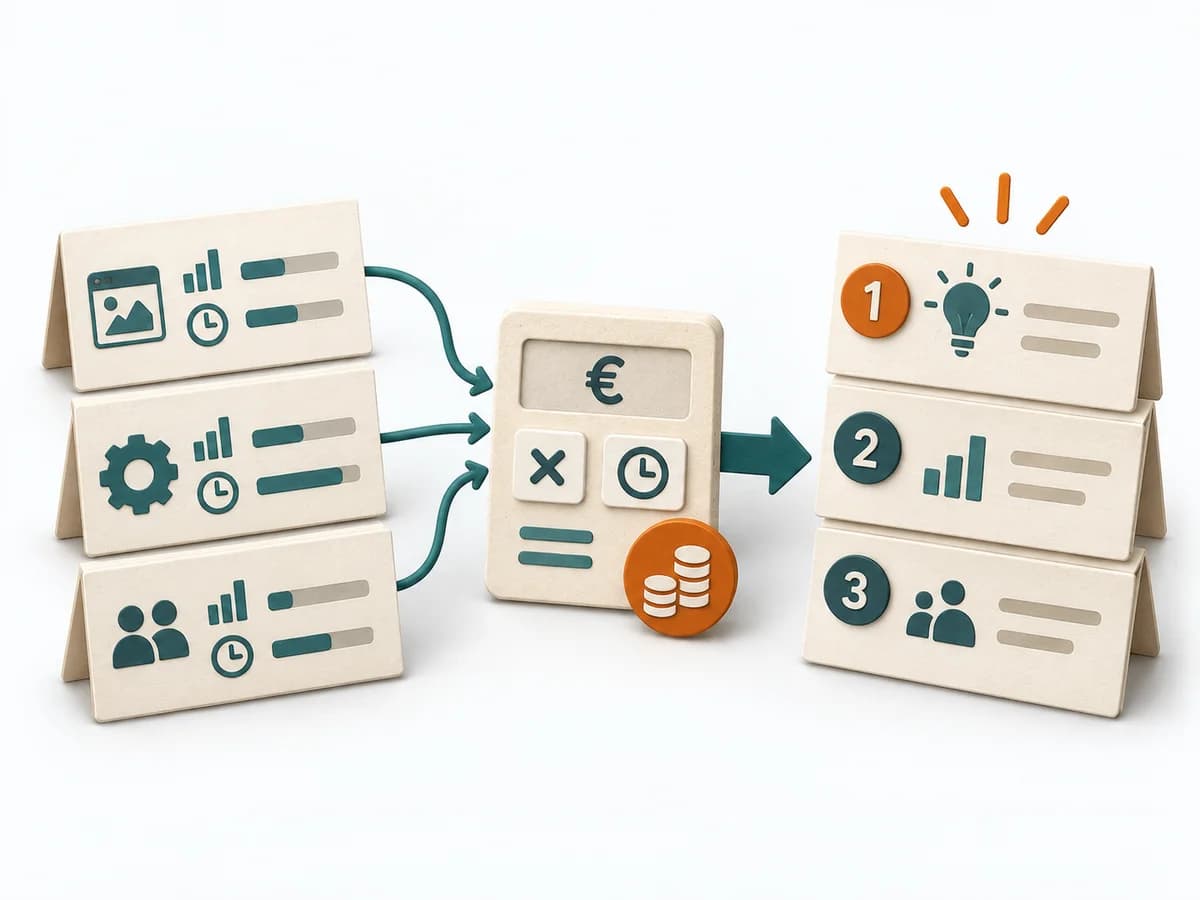 Delivery Cost of Delay | 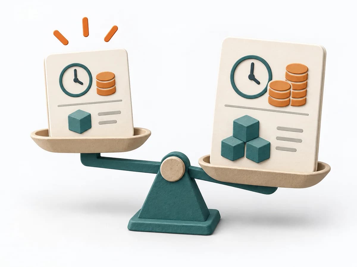 Agile WSJF |
|---|---|---|---|
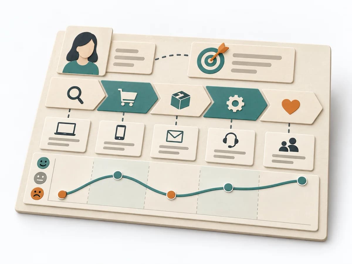
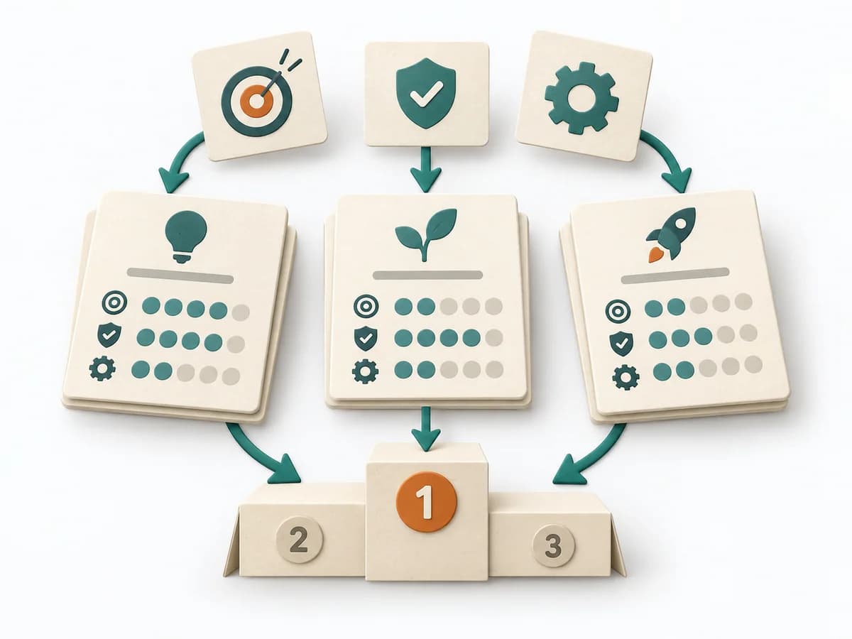
Purposedifferent | When a user journey falls apart across many touchpoints, customer journey mapping makes the experience visible as a coherent arc. Phases, emotions, and breaks become legible enough to prioritize critical moments deliberately. | Helps clarify scope, order, and delivery flow in concrete terms. It makes work, constraints, and sequence manageable. The result is captured as a Cost of Delay table and prioritization sequence. | When many tasks compete for the same capacity, it orders work by economic impact. It makes time lost, benefit, and effort comparable together. |
Complexitydifferent | Medium | High | High |
Timedifferent | 2-4 h | 90-180 min | 45-90 min |
Participantsdifferent | 4-10 | 3-8 | 3-10 |
Formatsame | Workshop | Workshop | Workshop |
Outputdifferent | Journey Map, Pain-point List, Opportunity Backlog | CoD Table, Prioritization Sequence | Ranked Backlog, Cost-of-Delay Assumptions |
Tagsno overlap | JourneyServiceService design | PrioritizationDeliveryEconomicsDecision | LeanEconomicsSequencePrioritization |
Often compared together
Methods with strong topical overlap with the current selection, not yet in the comparison.