View methods side by side.
Choose up to four methods. Add them using the search and share the comparison by copying its link.
| Criterion | 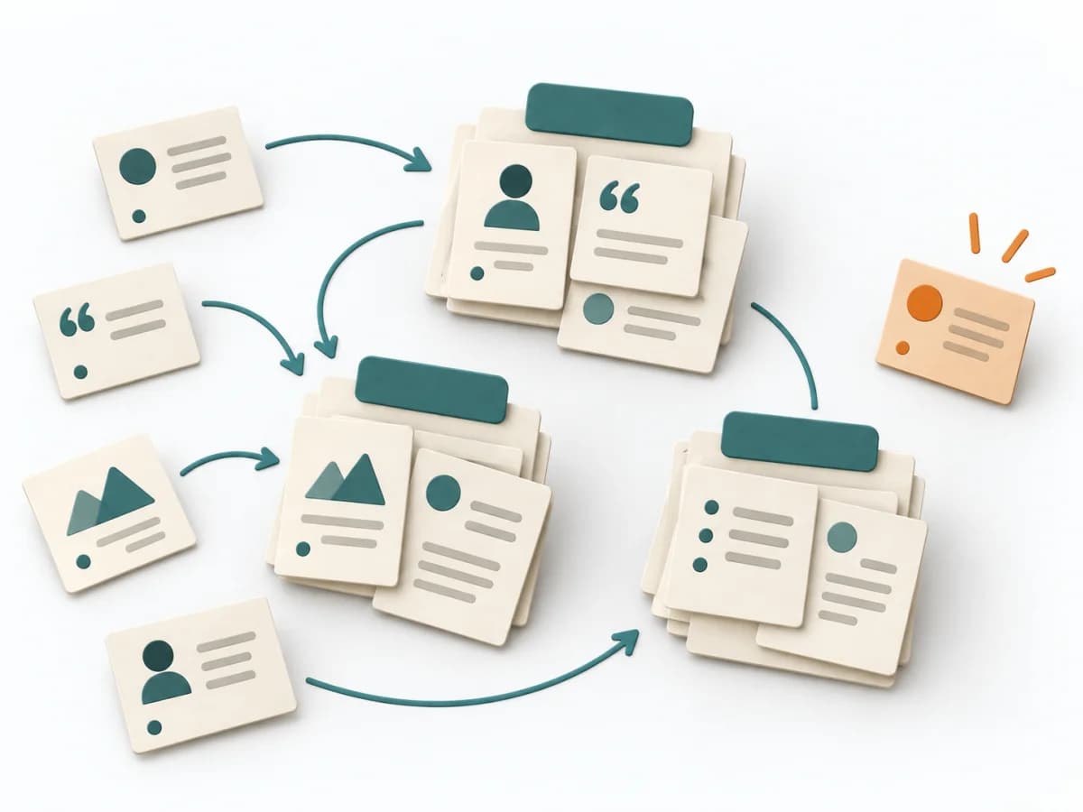 UX Research Affinity Diagramming | 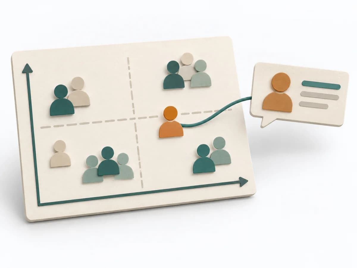 Facilitation Stakeholder Mapping | 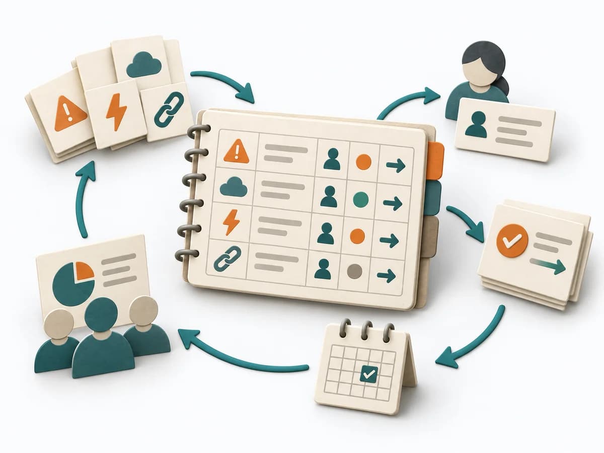 Delivery RAID Log |
|---|---|---|---|
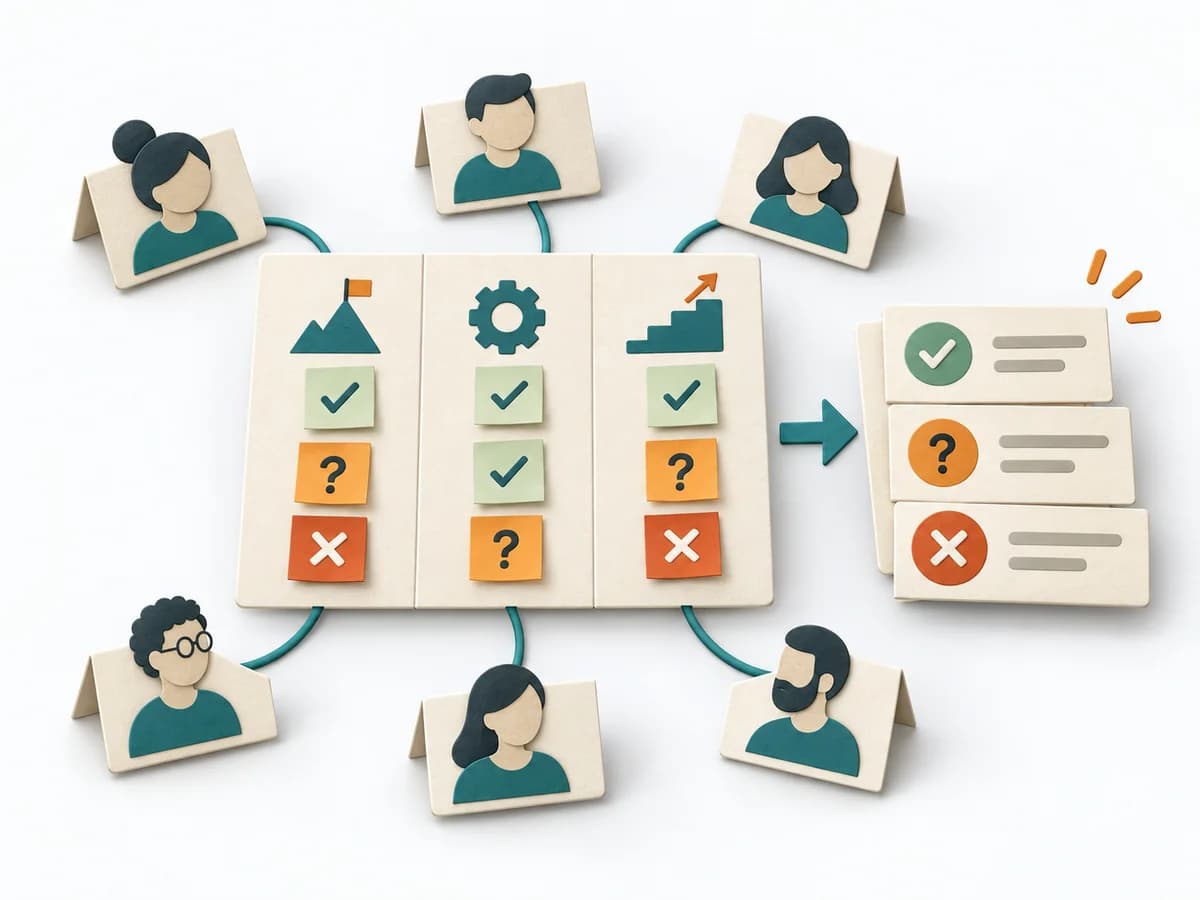
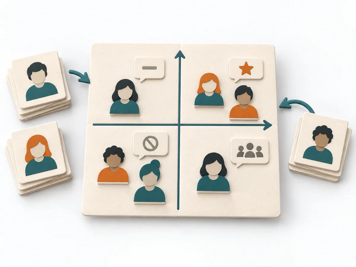
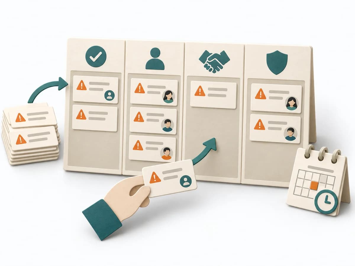
Purposedifferent | When research notes, feedback, or observations sit unconnected side by side, affinity diagramming sorts the raw material into solid themes. Many individual points turn into patterns that make decisions and opportunities clearer. | When an initiative depends on many people, interests, and power dynamics, Stakeholder Mapping systematically orders the environment. It shows who influences, who is affected, and where relationship management or safeguarding matters first. | Helps clarify scope, sequence, and delivery flow in concrete terms. It makes work, boundaries, and order steerable. The result is captured as a RAID Log and a source for status reporting. |
Complexitysame | Low | Low | Low |
Timedifferent | 45–90 min | 60–90 min | 30 min Setup, dann laufend |
Participantsdifferent | 3-10 | 2-8 | 1-3 maintaining, briefing for everyone |
Formatdifferent | Workshop | Workshop + async | Async |
Outputdifferent | Theme clusters, Insight statements, Opportunity areas | Stakeholder Map, Engagement Plan, Risk Notes | RAID Log, Status Report Source |
Tagsno overlap | SynthesisQualitativeRoot cause | StakeholdersAlignmentFacilitationChange | RiskTrackingStakeholdersGovernance |
Often compared together
Methods with strong topical overlap with the current selection, not yet in the comparison.