View methods side by side.
Choose up to four methods. Add them using the search and share the comparison by copying its link.
| Criterion | 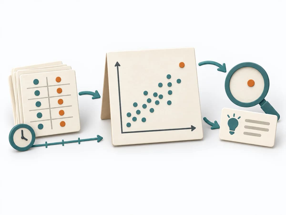 Operations Scatter Diagram |  Operations Fishbone Diagram |  Architecture Architecture Communication Canvas |
|---|---|---|---|
Purposedifferent | When the question is whether two measures are related, the method makes patterns in the data picture visible. It separates felt correlations from relationships that actually show up in the data. | When a problem has several possible contributing factors, the method sorts causes by cause areas. It prevents an initial hunch from blocking the view of other plausible drivers. | The Architecture Communication Canvas plans architecture communication so the right people receive the right message. The method turns technical complexity into deliberate communication design. |
Complexitydifferent | Low | Low | Medium |
Timedifferent | 30-90 min | 30-60 min | 60-120 min |
Participantsdifferent | 1-4 | 2-8 | 2-8 |
Formatdifferent | Workshop + async | Workshop | Workshop + async |
Outputdifferent | Scatter Plot, Korrelationsnotiz, Hypothesenliste | Fishbone Diagram, Cause Categories, Investigation Backlog | Communication Canvas, Stakeholder Messages, Architecture Communication Plan |
Tagsno overlap | Root causeQualityVisualization | Root causeQualityOperations | ArchitectureCommunicationStakeholdersCanvas |
Often compared together
Methods with strong topical overlap with the current selection, not yet in the comparison.