View methods side by side.
Choose up to four methods. Add them using the search and share the comparison by copying its link.
| Criterion | 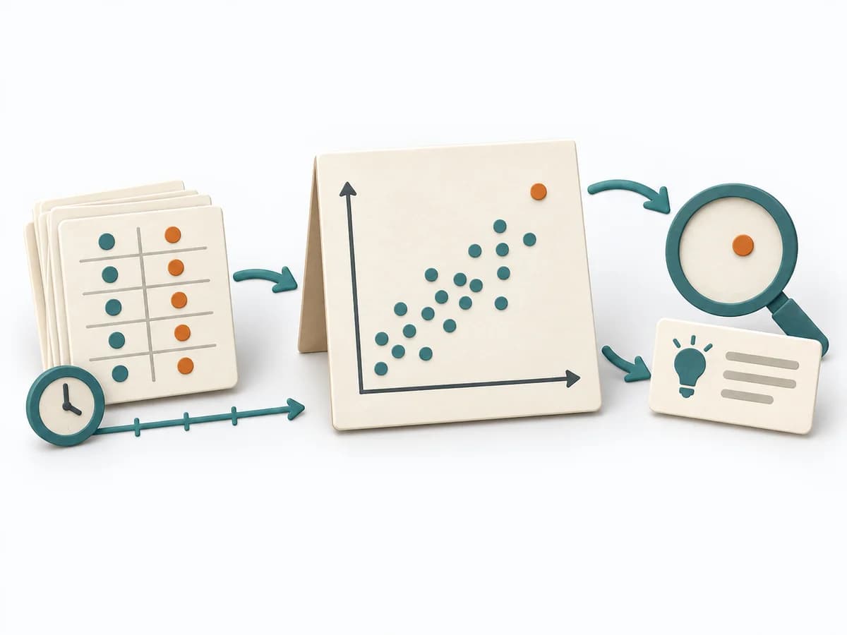 Operations Scatter Diagram | 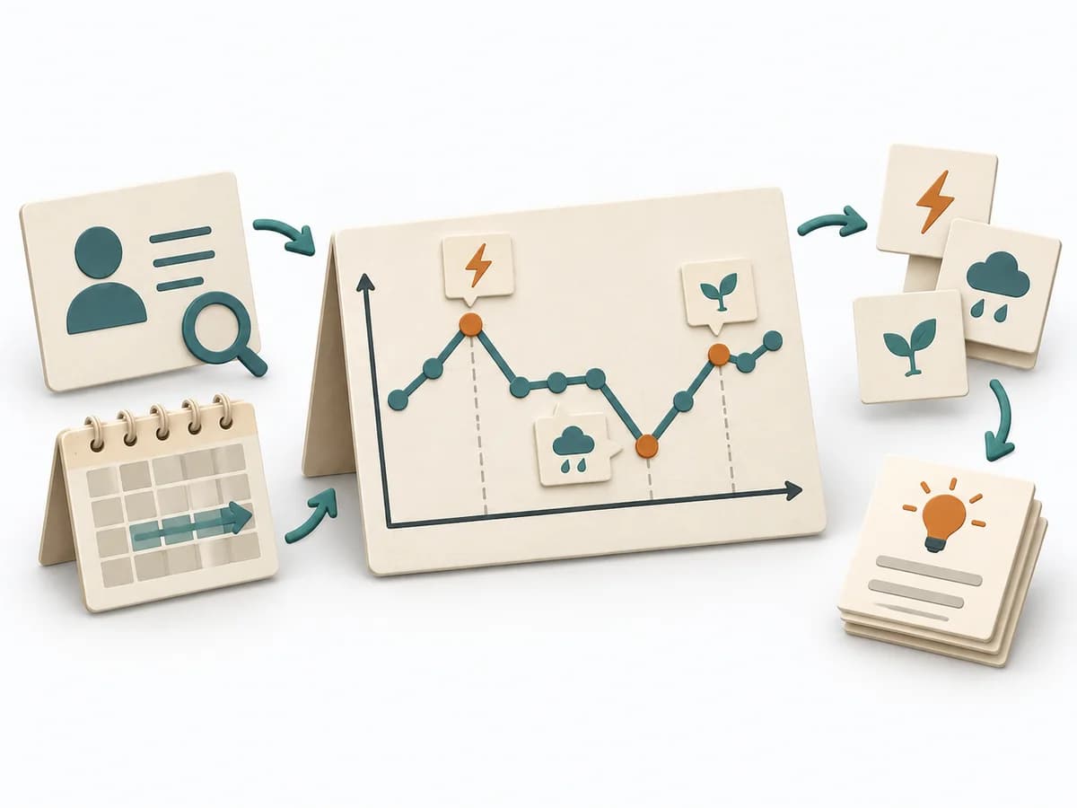 Systems Thinking Behavior Over Time Graph | 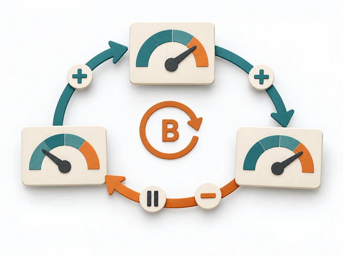 Systems Thinking Causal Loop Diagram |
|---|---|---|---|
Purposedifferent | When the question is whether two measures are related, the method makes patterns in the data picture visible. It separates felt correlations from relationships that actually show up in the data. | A Behavior Over Time Graph shows how a metric or observation develops over time. The method makes trends, breaks, and recurring patterns visible that get lost in snapshots. | A Causal Loop Diagram makes feedback, reinforcement, and balance in a system legible. It uncovers side effects and self-reinforcement that stay hidden in linear explanations. |
Complexitydifferent | Low | Low | Medium |
Timedifferent | 30-90 min | 20-45 min | 1-3 h |
Participantsdifferent | 1-4 | 1-10 | 2-8 |
Formatdifferent | Workshop + async | Workshop + async | Workshop |
Outputdifferent | Scatter Plot, Korrelationsnotiz, Hypothesenliste | Behavior Over Time Graph, Trend Hypotheses, Key Events | Causal Loop Diagram, Feedback Notes, Leverage Points |
Tagsno overlap | Root causeQualityVisualization | Systems thinkingPatternsDynamics | FeedbackSystems thinkingCausalityDynamics |
Often compared together
Methods with strong topical overlap with the current selection, not yet in the comparison.