View methods side by side.
Choose up to four methods. Add them using the search and share the comparison by copying its link.
| Criterion | 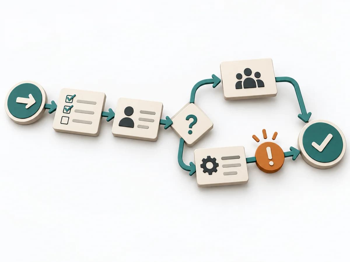 Operations Process Mapping | 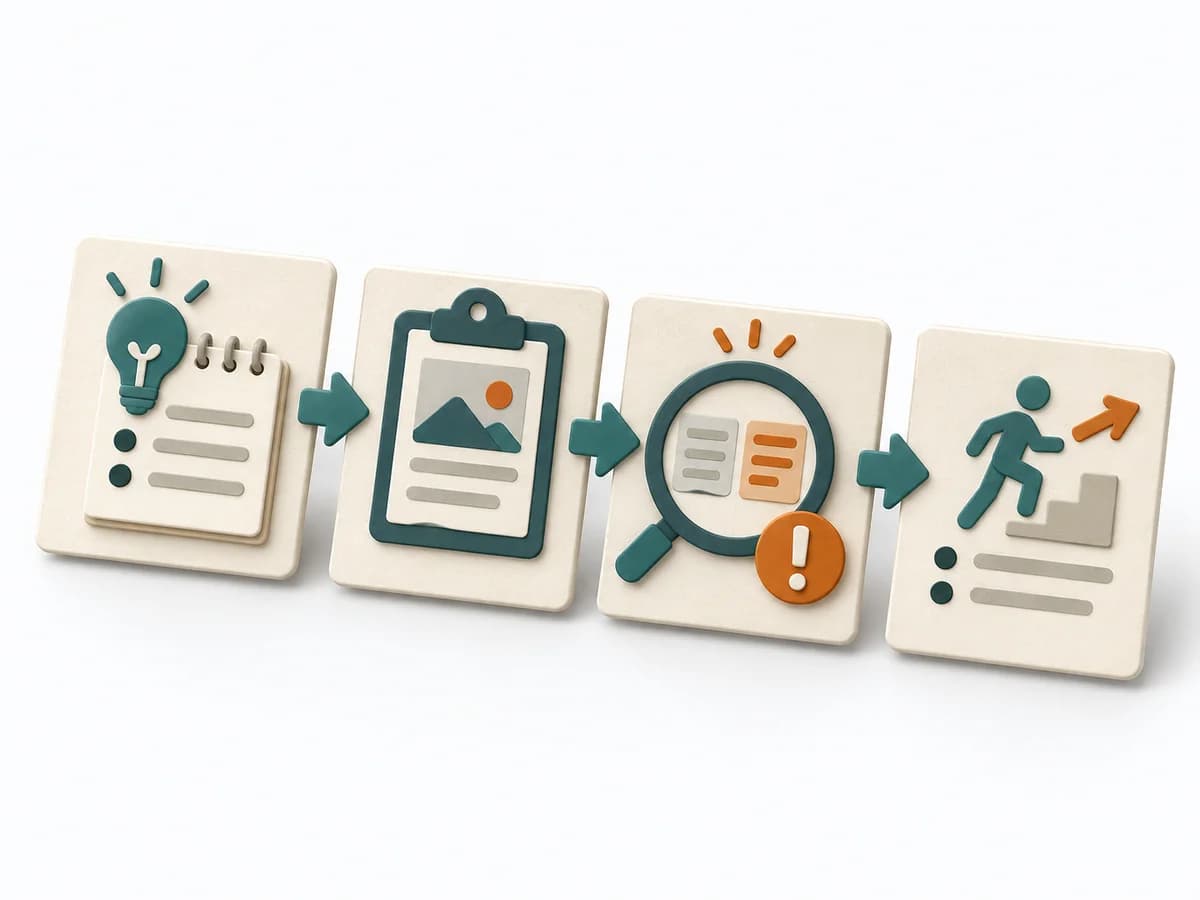 Operations After-Action Review | 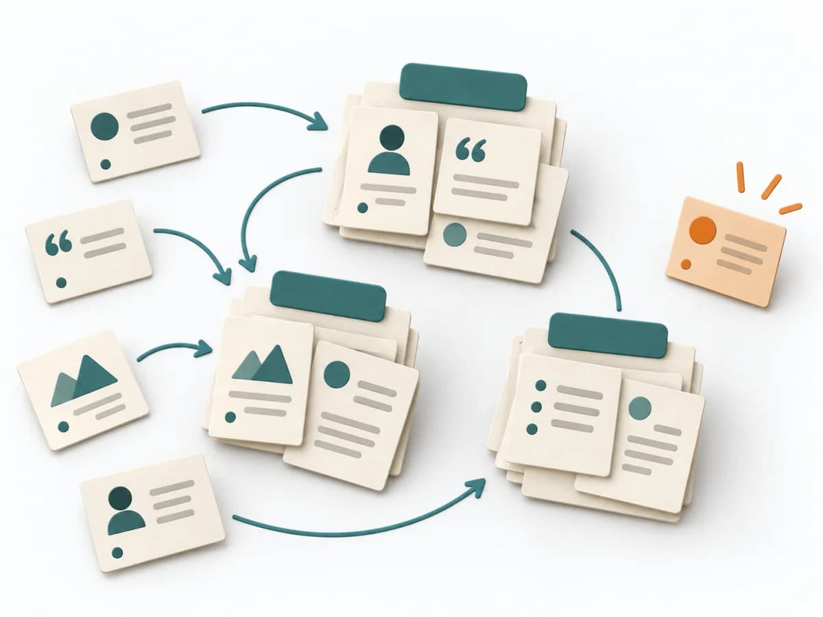 UX Research Affinity Diagramming |
|---|---|---|---|
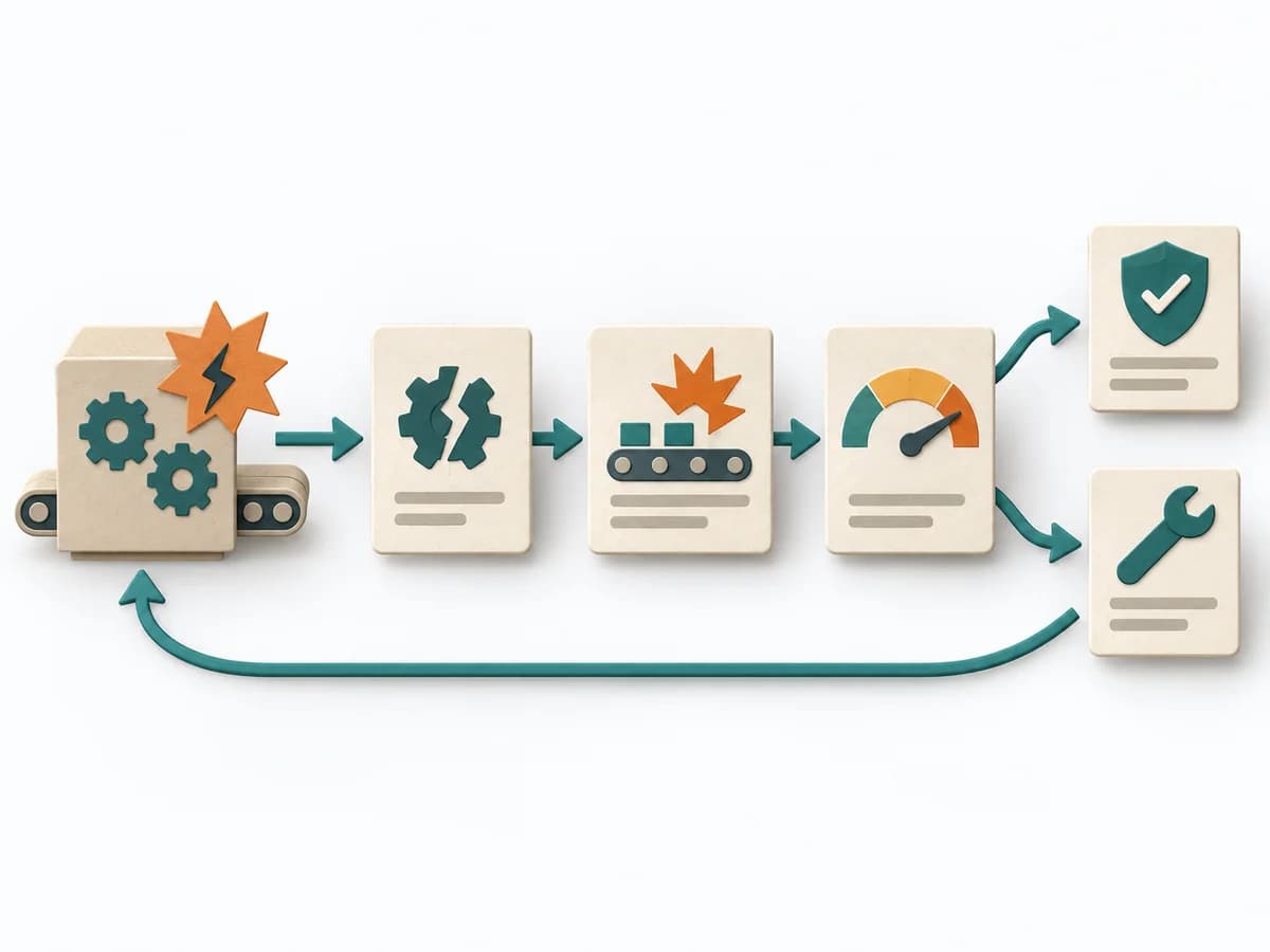
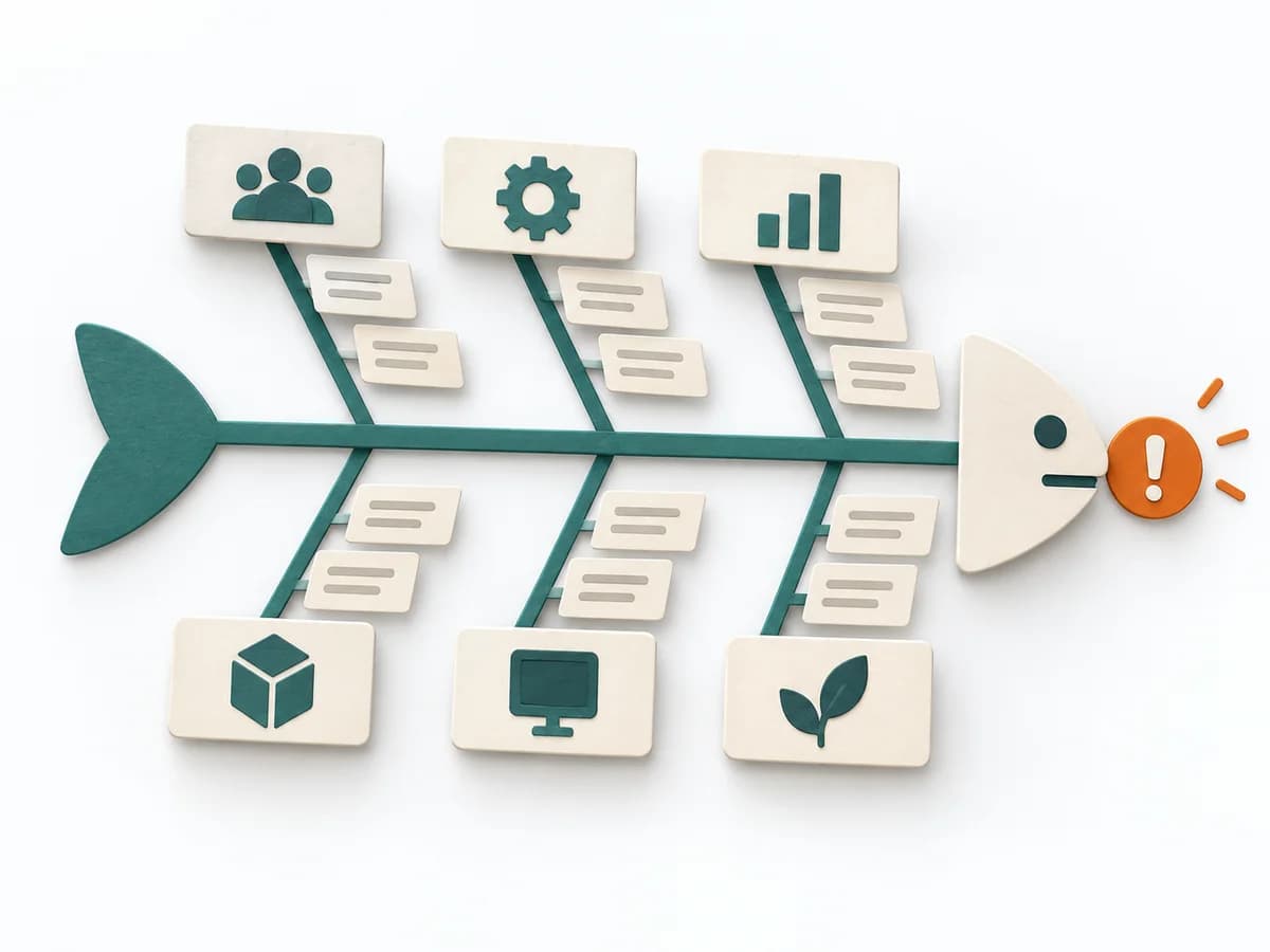
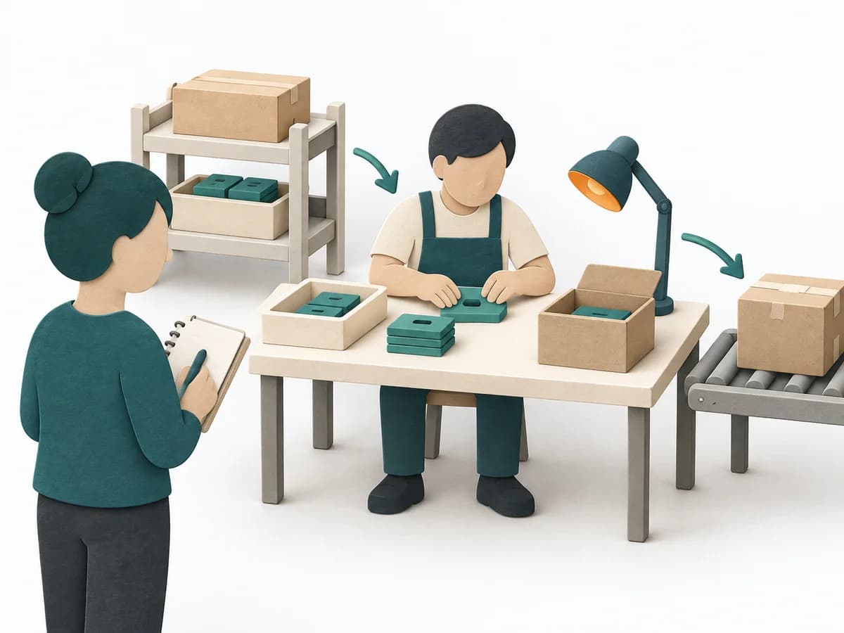
Purposedifferent | With a confusing workflow that has many handoffs, the method makes the actual process visible. It shows where work is passed on, delayed, or duplicated, so improvement targets the right spots. | After missions or project phases with unclear outcomes, the method makes visible what actually happened and what can be learned from it. It separates course, effect, and causes so experience turns into solid improvement. | When research notes, feedback, or observations sit unconnected side by side, affinity diagramming sorts the raw material into solid themes. Many individual points turn into patterns that make decisions and opportunities clearer. |
Complexitydifferent | Medium | Low | Low |
Timedifferent | 1-3 h | 20-45 min | 45–90 min |
Participantsdifferent | 3-10 | 3-12 | 3-10 |
Formatdifferent | Workshop | Workshop + async | Workshop |
Outputdifferent | Process Map, Handoff List, Improvement Backlog | Lessons learned, Action items, Event summary | Theme clusters, Insight statements, Opportunity areas |
Tagsno overlap | ProcessOperationsImprovement | LearningOperationsImprovement | SynthesisQualitativeRoot cause |
Often compared together
Methods with strong topical overlap with the current selection, not yet in the comparison.