View methods side by side.
Choose up to four methods. Add them using the search and share the comparison by copying its link.
| Criterion | 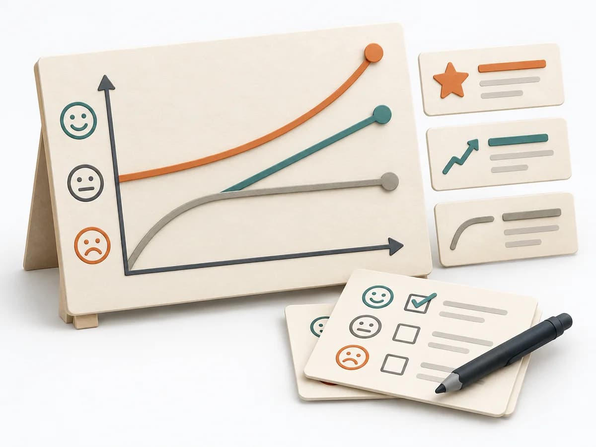 Product Discovery Kano Model | 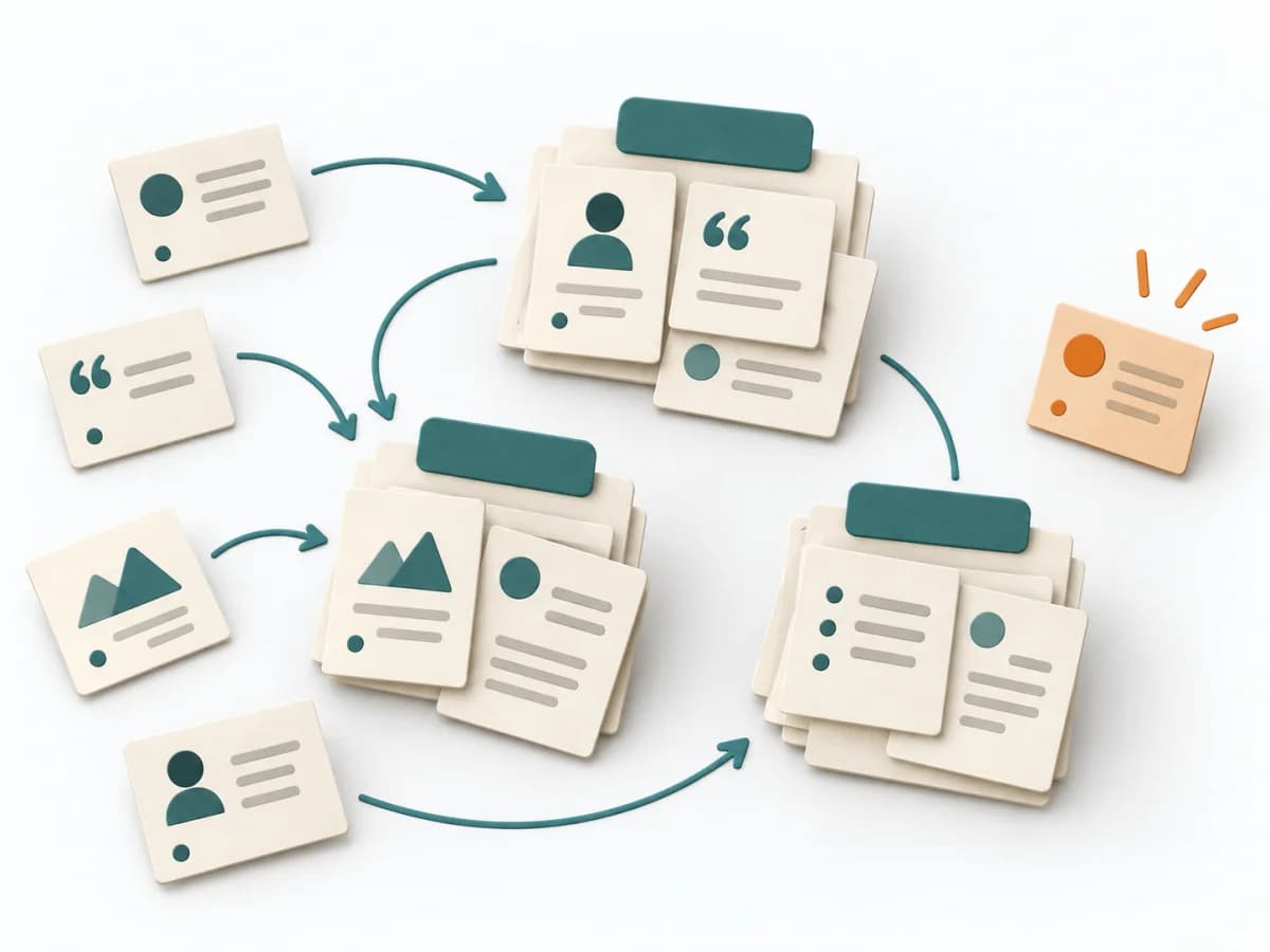 UX Research Affinity Diagramming | 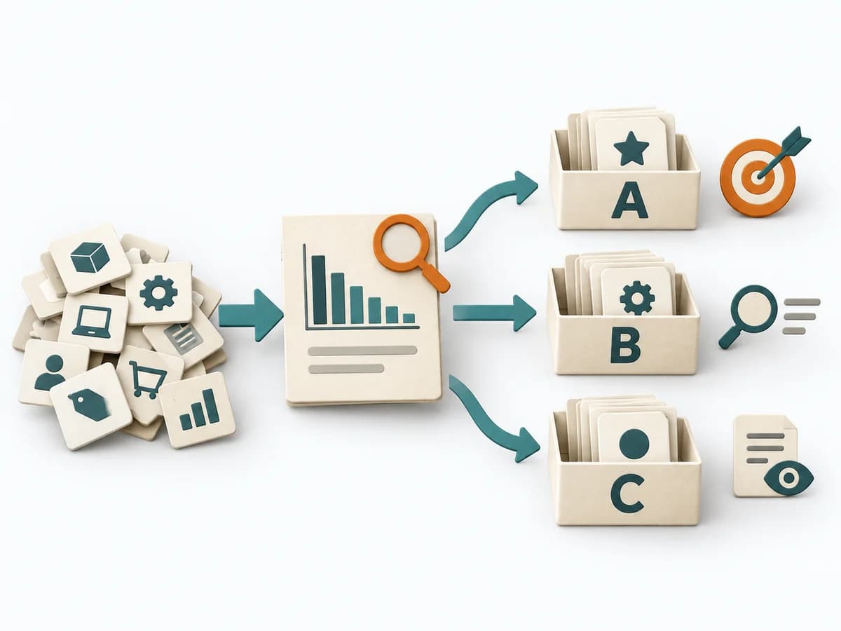 Operations ABC Analysis |
|---|---|---|---|
Purposedifferent | When features need to be distinguished by their effect on satisfaction, it makes expectations and surprises comparable. It separates basic needs, performance contribution, and delight. | When research notes, feedback, or observations sit unconnected side by side, affinity diagramming sorts the raw material into solid themes. Many individual points turn into patterns that make decisions and opportunities clearer. | With many similar objects of differing economic significance, the method prioritizes effort by effect. It separates what needs regular steering from what rarely needs attention. |
Complexitydifferent | Medium | Low | Low |
Timedifferent | 1-2 Tage | 45–90 min | 30-60 min |
Participantsdifferent | 10-50 | 3-10 | 1-5 |
Formatdifferent | Workshop + async | Workshop | Async |
Outputdifferent | Kano Matrix, Feature Classes, Priority Themes | Theme clusters, Insight statements, Opportunity areas | ABC Classification, Focus Rules, Control List |
Tagsno overlap | SatisfactionPrioritizationCustomer | SynthesisQualitativeRoot cause | PrioritizationOperationsPortfolio |
Often compared together
Methods with strong topical overlap with the current selection, not yet in the comparison.