View methods side by side.
Choose up to four methods. Add them using the search and share the comparison by copying its link.
| Criterion |  UX Research Affinity Diagramming | 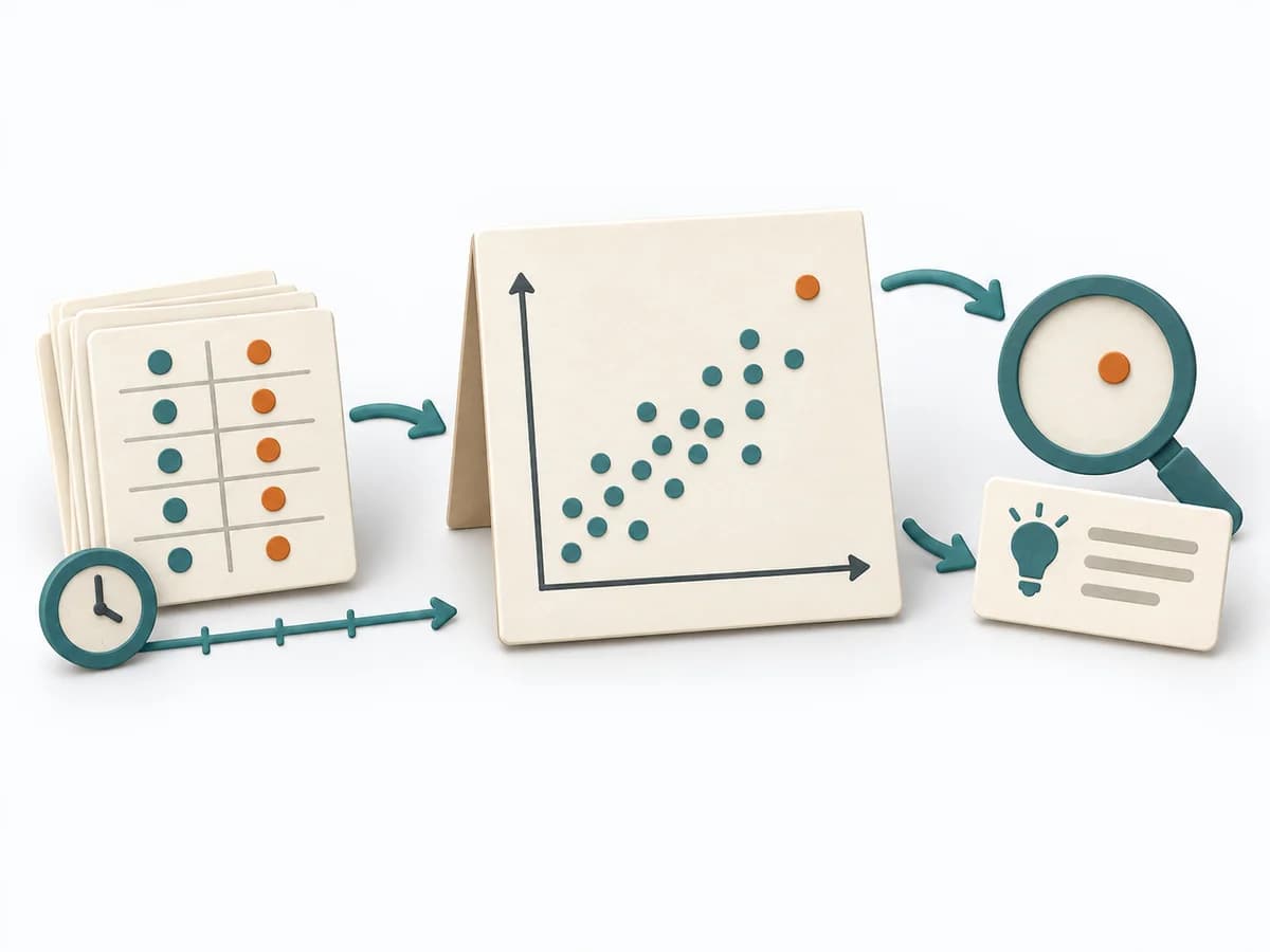 Operations Scatter Diagram |  Operations Root Cause Tree Analysis |
|---|---|---|---|
Purposedifferent | When research notes, feedback, or observations sit unconnected side by side, affinity diagramming sorts the raw material into solid themes. Many individual points turn into patterns that make decisions and opportunities clearer. | When the question is whether two measures are related, the method makes patterns in the data picture visible. It separates felt correlations from relationships that actually show up in the data. | For a problem with several suspected causes, the method builds a causal structure instead of a mere list. It makes visible how causes connect and where the strongest points of leverage lie. |
Complexitydifferent | Low | Low | Medium |
Timedifferent | 45–90 min | 30-90 min | 1-3 h |
Participantsdifferent | 3-10 | 1-4 | 2-8 |
Formatdifferent | Workshop | Workshop + async | Workshop |
Outputdifferent | Theme clusters, Insight statements, Opportunity areas | Scatter Plot, Korrelationsnotiz, Hypothesenliste | Cause Tree, Evidence Notes, Countermeasures |
Tags1 shared | SynthesisQualitativeRoot cause | Root causeQualityVisualization | Root causeTreeIncidentQuality |
Often compared together
Methods with strong topical overlap with the current selection, not yet in the comparison.