View methods side by side.
Choose up to four methods. Add them using the search and share the comparison by copying its link.
| Criterion |  Agile WSJF |  Operations Process Mapping | 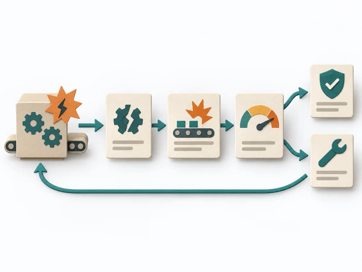 Operations Failure Mode and Effects Analysis |
|---|---|---|---|
Purposedifferent | When many tasks compete for the same capacity, it orders work by economic impact. It makes time lost, benefit, and effort comparable together. | With a confusing workflow that has many handoffs, the method makes the actual process visible. It shows where work is passed on, delayed, or duplicated, so improvement targets the right spots. | For a process, product, or service with noticeable failure risks, the method assesses possible failure modes in advance. It directs attention to combinations of occurrence, effect, and detectability. |
Complexitydifferent | High | Medium | High |
Timedifferent | 45-90 min | 1-3 h | 2-6 h |
Participantssame | 3-10 | 3-10 | 3-10 |
Formatsame | Workshop | Workshop | Workshop |
Outputdifferent | Ranked Backlog, Cost-of-Delay Assumptions | Process Map, Handoff List, Improvement Backlog | FMEA Table, Risk Priority, Mitigation Actions |
Tagsno overlap | LeanEconomicsSequencePrioritization | ProcessOperationsImprovement | RiskQualityOperationsRoot cause |
Often compared together
Methods with strong topical overlap with the current selection, not yet in the comparison.