View methods side by side.
Choose up to four methods. Add them using the search and share the comparison by copying its link.
| Criterion | 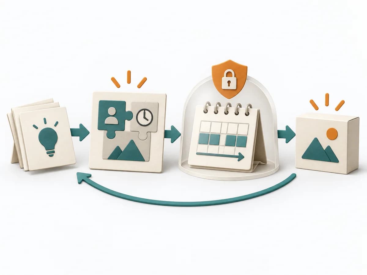 Delivery Shape Up | 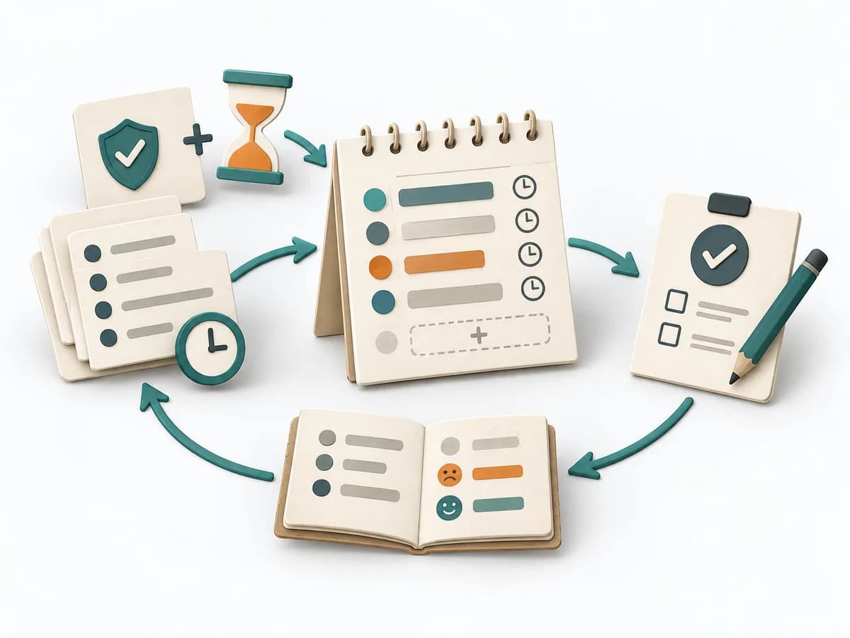 Operations ALPEN Method | 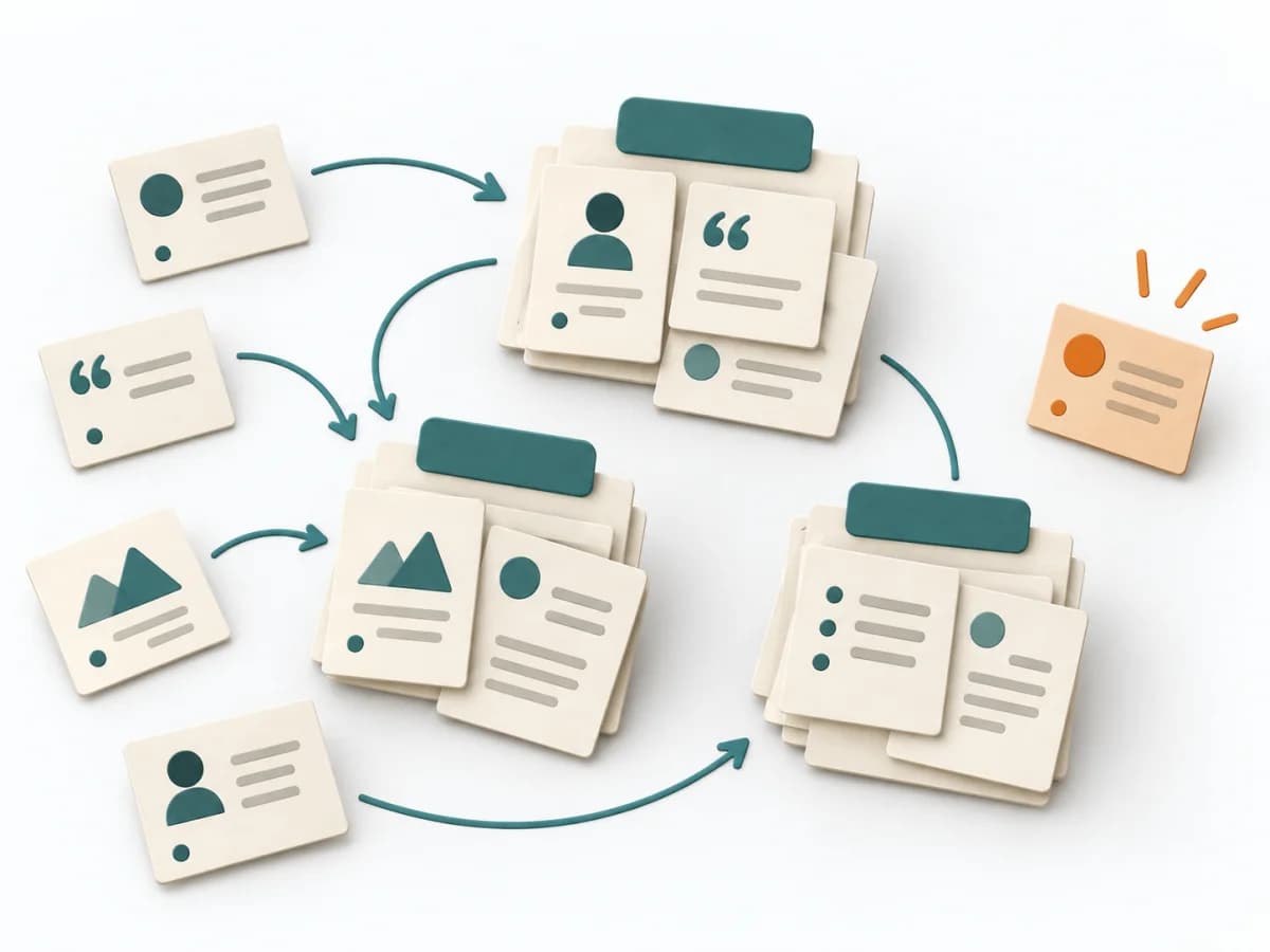 UX Research Affinity Diagramming |
|---|---|---|---|
Purposedifferent | Shape Up helps clarify scope, sequence, and delivery flow. It makes work boundaries and decisions explicit and captures results as pitches, bet-table decisions, and hill charts. | With an overloaded day full of too many tasks, a realistic picture of the day emerges. The method connects estimating, deciding, and buffer thinking so planning fits available energy and time. | When research notes, feedback, or observations sit unconnected side by side, affinity diagramming sorts the raw material into solid themes. Many individual points turn into patterns that make decisions and opportunities clearer. |
Complexitydifferent | Medium | Low | Low |
Timedifferent | 6 Wochen Cycle + 2 Wochen Cool-Down | 10-20 min daily | 45–90 min |
Participantsdifferent | 2-4 pro Pitch | 1 | 3-10 |
Formatdifferent | Workshop + async | Async | Workshop |
Outputdifferent | Pitches, Bet-table decisions, Hill charts, Cooldown outcomes | Daily Plan, Time Estimates, Review Notes | Theme clusters, Insight statements, Opportunity areas |
Tagsno overlap | PlanningDeliveryAutonomy | PlanningTime managementProductivityOperations | SynthesisQualitativeRoot cause |
Often compared together
Methods with strong topical overlap with the current selection, not yet in the comparison.