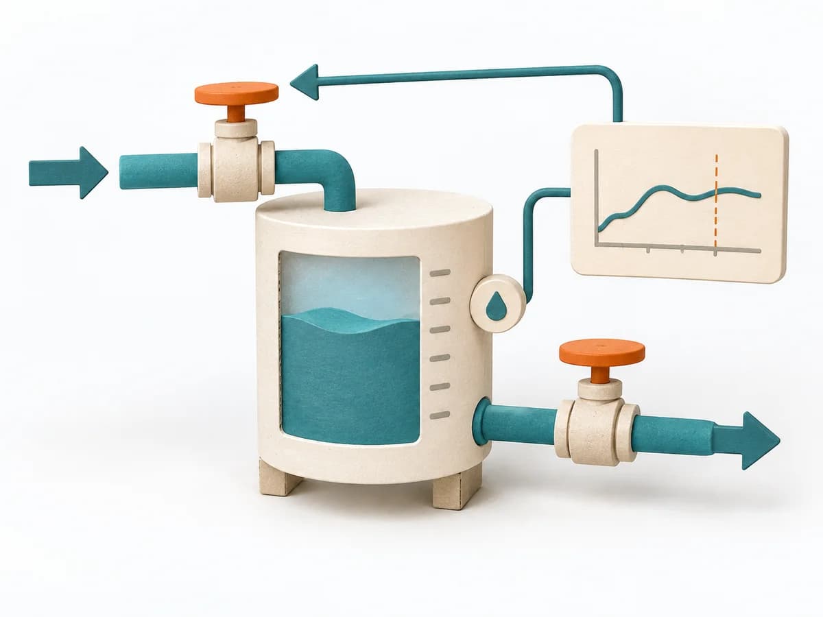
View methods side by side.
Choose up to four methods. Add them using the search and share the comparison by copying its link.
| Criterion |  UX Research HEART Framework | 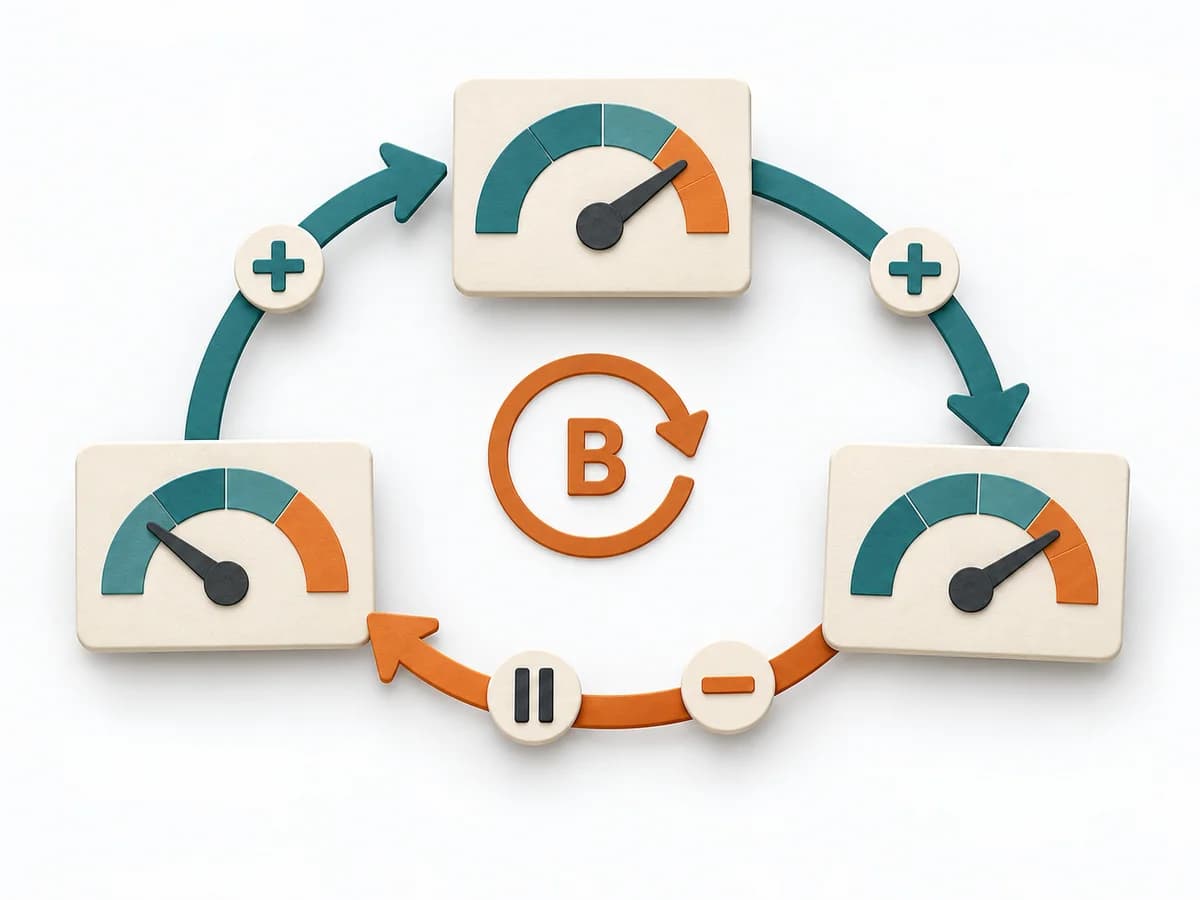 Systems Thinking Causal Loop Diagram | 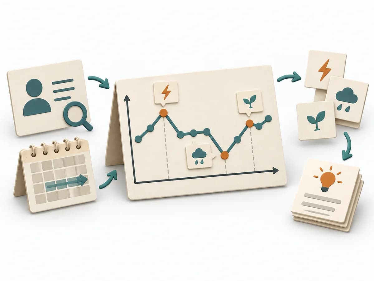 Systems Thinking Behavior Over Time Graph |
|---|---|---|---|
Purposedifferent | Helps clarify observations, needs, and patterns in concrete terms. It groups observations into patterns, questions, and decisions. The result is captured as a HEART-GSM table and dashboard. | A Causal Loop Diagram makes feedback, reinforcement, and balance in a system legible. It uncovers side effects and self-reinforcement that stay hidden in linear explanations. | A Behavior Over Time Graph shows how a metric or observation develops over time. The method makes trends, breaks, and recurring patterns visible that get lost in snapshots. |
Complexitydifferent | Medium | Medium | Low |
Timedifferent | 120 min initial, dann laufend | 1-3 h | 20-45 min |
Participantsdifferent | 3-6 | 2-8 | 1-10 |
Formatdifferent | Workshop + async | Workshop | Workshop + async |
Outputdifferent | HEART-GSM Table, Dashboard | Causal Loop Diagram, Feedback Notes, Leverage Points | Behavior Over Time Graph, Trend Hypotheses, Key Events |
Tagsno overlap | MetricsUX researchMeasurementSatisfaction | FeedbackSystems thinkingCausalityDynamics | Systems thinkingPatternsDynamics |
Often compared together
Methods with strong topical overlap with the current selection, not yet in the comparison.