View methods side by side.
Choose up to four methods. Add them using the search and share the comparison by copying its link.
| Criterion | 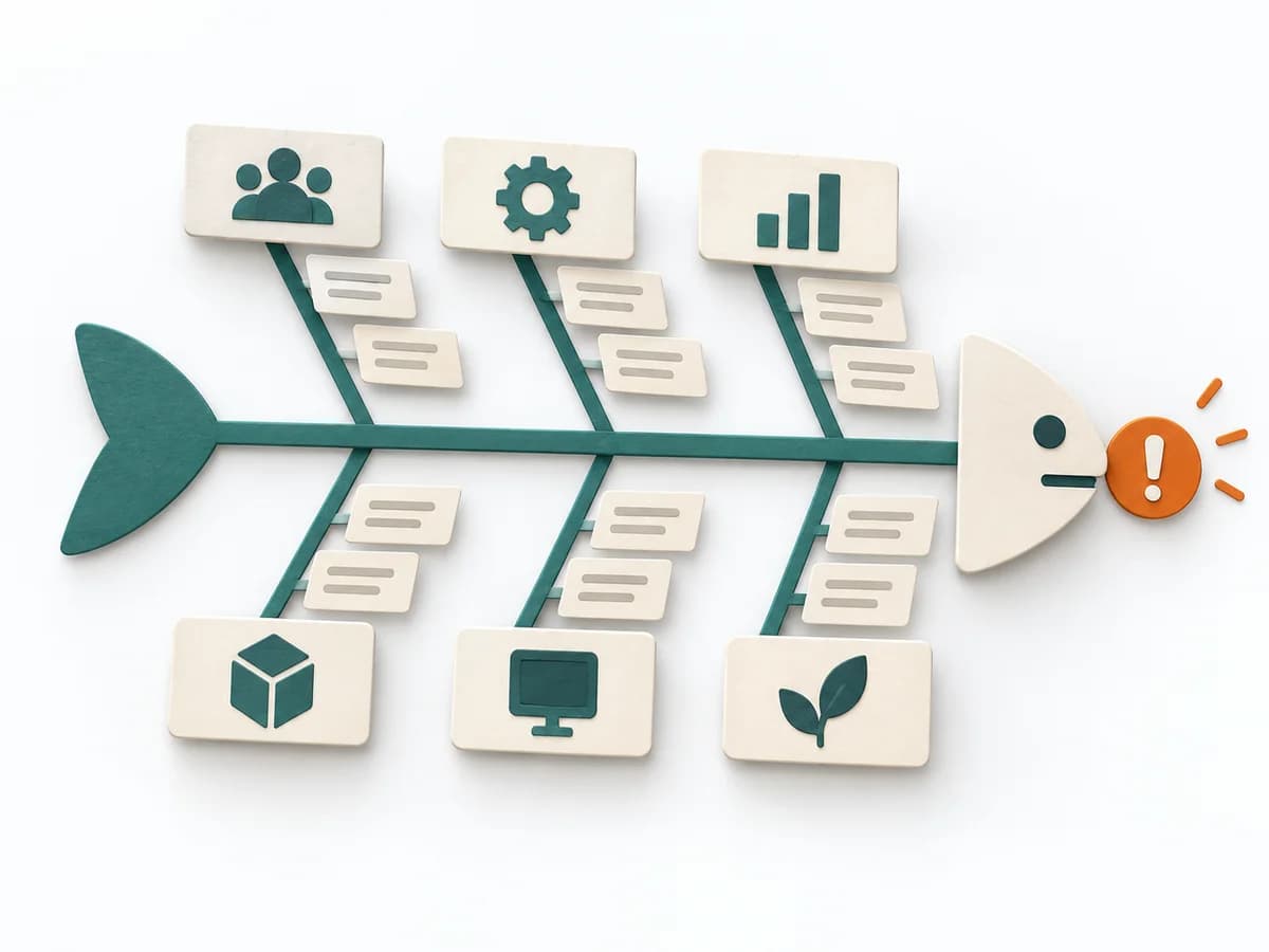 Operations Fishbone Diagram | 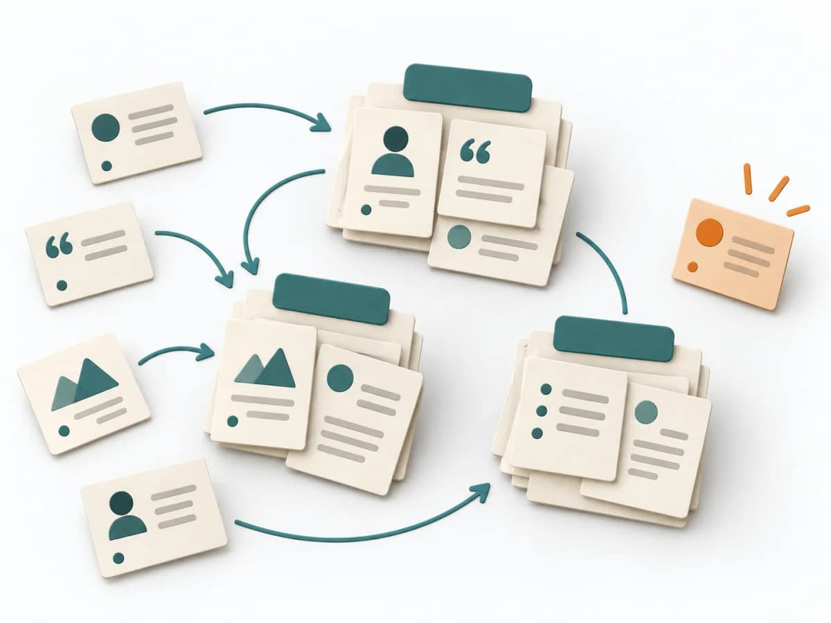 UX Research Affinity Diagramming | 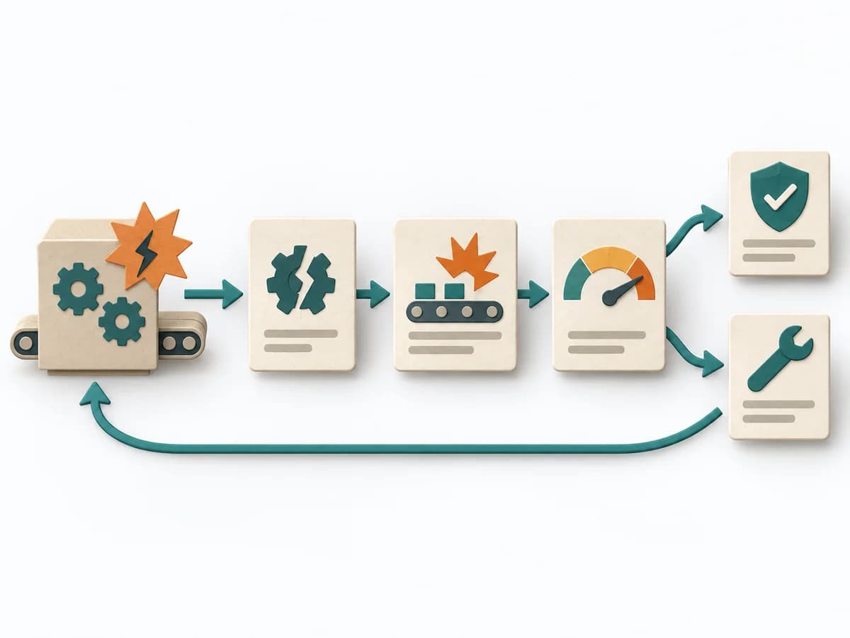 Operations Failure Mode and Effects Analysis |
|---|---|---|---|
Purposedifferent | When a problem has several possible contributing factors, the method sorts causes by cause areas. It prevents an initial hunch from blocking the view of other plausible drivers. | When research notes, feedback, or observations sit unconnected side by side, affinity diagramming sorts the raw material into solid themes. Many individual points turn into patterns that make decisions and opportunities clearer. | For a process, product, or service with noticeable failure risks, the method assesses possible failure modes in advance. It directs attention to combinations of occurrence, effect, and detectability. |
Complexitydifferent | Low | Low | High |
Timedifferent | 30-60 min | 45–90 min | 2-6 h |
Participantsdifferent | 2-8 | 3-10 | 3-10 |
Formatsame | Workshop | Workshop | Workshop |
Outputdifferent | Fishbone Diagram, Cause Categories, Investigation Backlog | Theme clusters, Insight statements, Opportunity areas | FMEA Table, Risk Priority, Mitigation Actions |
Tags1 shared | Root causeQualityOperations | SynthesisQualitativeRoot cause | RiskQualityOperationsRoot cause |
Often compared together
Methods with strong topical overlap with the current selection, not yet in the comparison.