View methods side by side.
Choose up to four methods. Add them using the search and share the comparison by copying its link.
| Criterion |  UX Research Usability Testing | 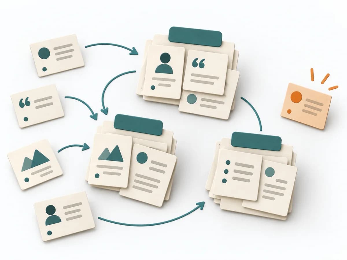 UX Research Affinity Diagramming |  UX Research Surveys |  UX Research Empathy Mapping |
|---|---|---|---|---|
Purposedifferent | When a product is built but people get stuck on tasks, usability testing shows the friction at concrete points. Observed use instead of self-report makes visible where orientation, understanding, or interaction breaks down. | When research notes, feedback, or observations sit unconnected side by side, affinity diagramming sorts the raw material into solid themes. Many individual points turn into patterns that make decisions and opportunities clearer. | When a topic needs to be validated broadly and many people can answer the same question, surveys gather structured feedback in a scalable form. Answers become comparable and segmentable instead of remaining merely anecdotal. | When a lot is assumed about a target group but little is seen jointly, empathy mapping makes knowledge and gaps directly comparable. The picture also shows which assumptions hold up and where evidence is missing. |
Complexitydifferent | Medium | Low | Medium | Low |
Timedifferent | 1-2 h je Session | 45–90 min | 3-14 Tage | 30–60 min |
Participantsdifferent | Based on research question | 3-10 | 50+ | 4-8 |
Formatdifferent | Workshop + async | Workshop | Async | Workshop |
Outputdifferent | Usability Issues, Severity List, Recommendations | Theme clusters, Insight statements, Opportunity areas | Survey Results, Charts, Segment Insights | Empathy Map, Assumptions List, Research Gaps |
Tagsno overlap | ValidationUXPrototype | SynthesisQualitativeRoot cause | QuantitativeResearchValidation | SynthesisQualitativeWorkshop |