View methods side by side.
Choose up to four methods. Add them using the search and share the comparison by copying its link.
| Criterion | 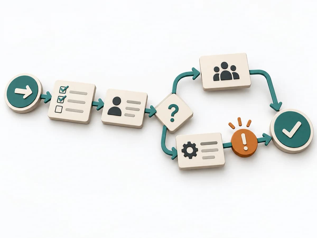 Operations Process Mapping | 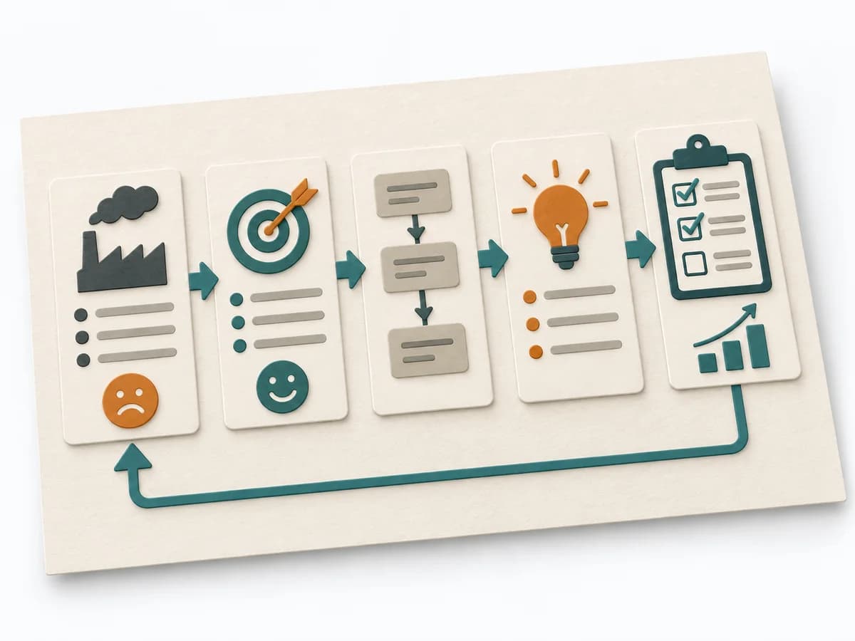 Operations A3 Problem Solving | 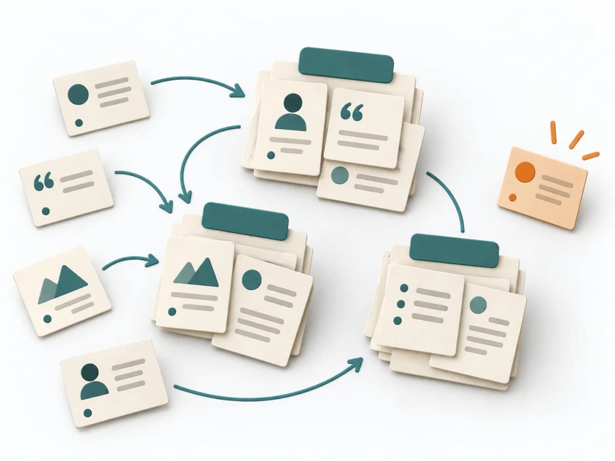 UX Research Affinity Diagramming | 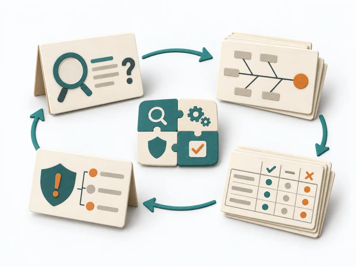 Operations Kepner-Tregoe |
|---|---|---|---|---|
Purposedifferent | With a confusing workflow that has many handoffs, the method makes the actual process visible. It shows where work is passed on, delayed, or duplicated, so improvement targets the right spots. | For a complex deviation with several people involved, the method bundles problem, analysis, and decision onto one page. It creates a shared working space where causes, countermeasures, and follow-up fit together. | When research notes, feedback, or observations sit unconnected side by side, affinity diagramming sorts the raw material into solid themes. Many individual points turn into patterns that make decisions and opportunities clearer. | For a disturbance that's hard to pin down, the method cleanly separates problem, cause, and decision. It reduces mixing when symptoms allow several interpretations. |
Complexitydifferent | Medium | Medium | Low | High |
Timedifferent | 1-3 h | 45-90 min | 45–90 min | 2-8 h |
Participantsdifferent | 3-10 | 2-5 | 3-10 | 2-8 |
Formatdifferent | Workshop | Workshop + async | Workshop | Workshop + async |
Outputdifferent | Process Map, Handoff List, Improvement Backlog | A3 Report, Action Plan, Root Cause Analysis | Theme clusters, Insight statements, Opportunity areas | Problem Analysis, Decision Analysis, Risk Plan |
Tagsno overlap | ProcessOperationsImprovement | LeanProblem solvingCoachingOperations | SynthesisQualitativeRoot cause | Problem solvingRoot causeDecisionOperations |