View methods side by side.
Choose up to four methods. Add them using the search and share the comparison by copying its link.
| Criterion |  Systems Thinking Polarity Mapping | 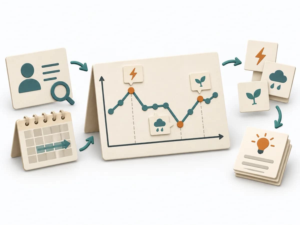 Systems Thinking Behavior Over Time Graph |  Agile Affinity Estimation | 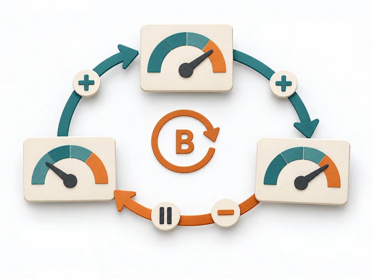 Systems Thinking Causal Loop Diagram |
|---|---|---|---|---|
Purposedifferent | Polarity Mapping makes tensions between two opposing poles tangible, such as standardization and adaptation or control and autonomy. The method guards against making apparent either-or decisions prematurely. | A Behavior Over Time Graph shows how a metric or observation develops over time. The method makes trends, breaks, and recurring patterns visible that get lost in snapshots. | When many tasks need to be classified quickly, it sorts them by perceived effort and similarity. It reduces the effort of fine-grained estimation for large volumes. | A Causal Loop Diagram makes feedback, reinforcement, and balance in a system legible. It uncovers side effects and self-reinforcement that stay hidden in linear explanations. |
Complexitydifferent | Medium | Low | Medium | Medium |
Timedifferent | 1-2 h | 20-45 min | 30-90 min | 1-3 h |
Participantsdifferent | 3-12 | 1-10 | 3-12 | 2-8 |
Formatdifferent | Workshop | Workshop + async | Workshop | Workshop |
Outputdifferent | Polarity Map, Warning Signs, Balance Actions | Behavior Over Time Graph, Trend Hypotheses, Key Events | Affinity Size Map, Grouped Estimates, Unclear Items | Causal Loop Diagram, Feedback Notes, Leverage Points |
Tagsno overlap | Systems thinkingTradeoffsLeadership | Systems thinkingPatternsDynamics | EstimationBacklogRelative sizing | FeedbackSystems thinkingCausalityDynamics |