View methods side by side.
Choose up to four methods. Add them using the search and share the comparison by copying its link.
| Criterion | 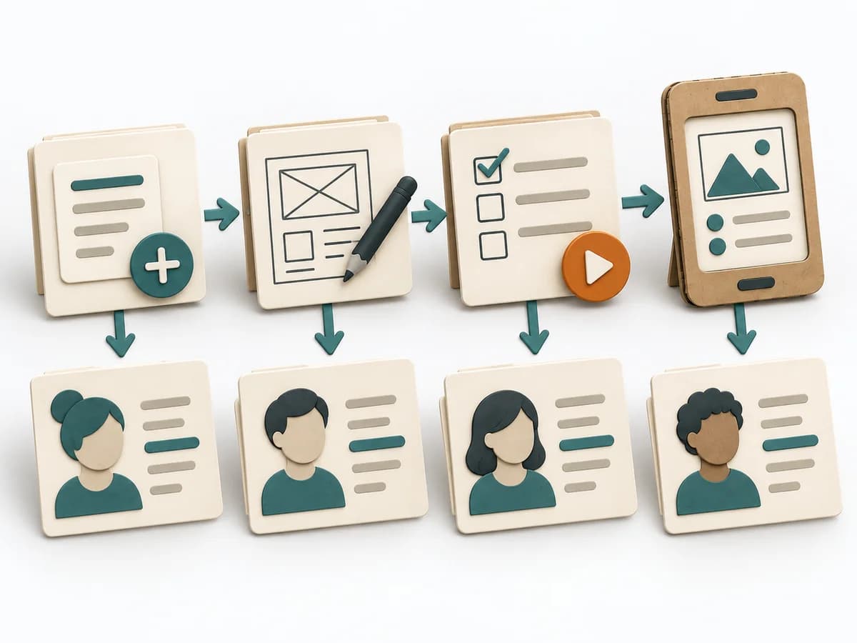 Knowledge Modeling Event Modeling | 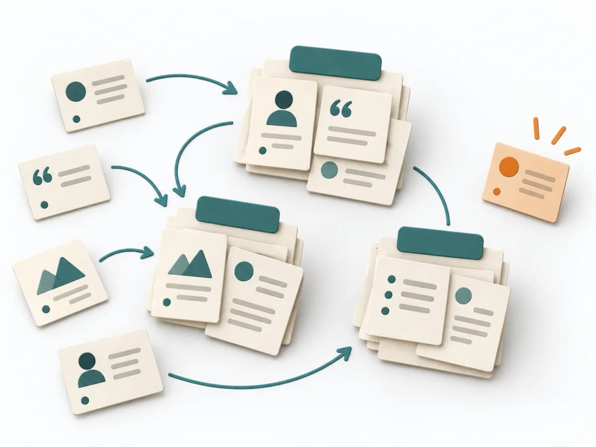 UX Research Affinity Diagramming | 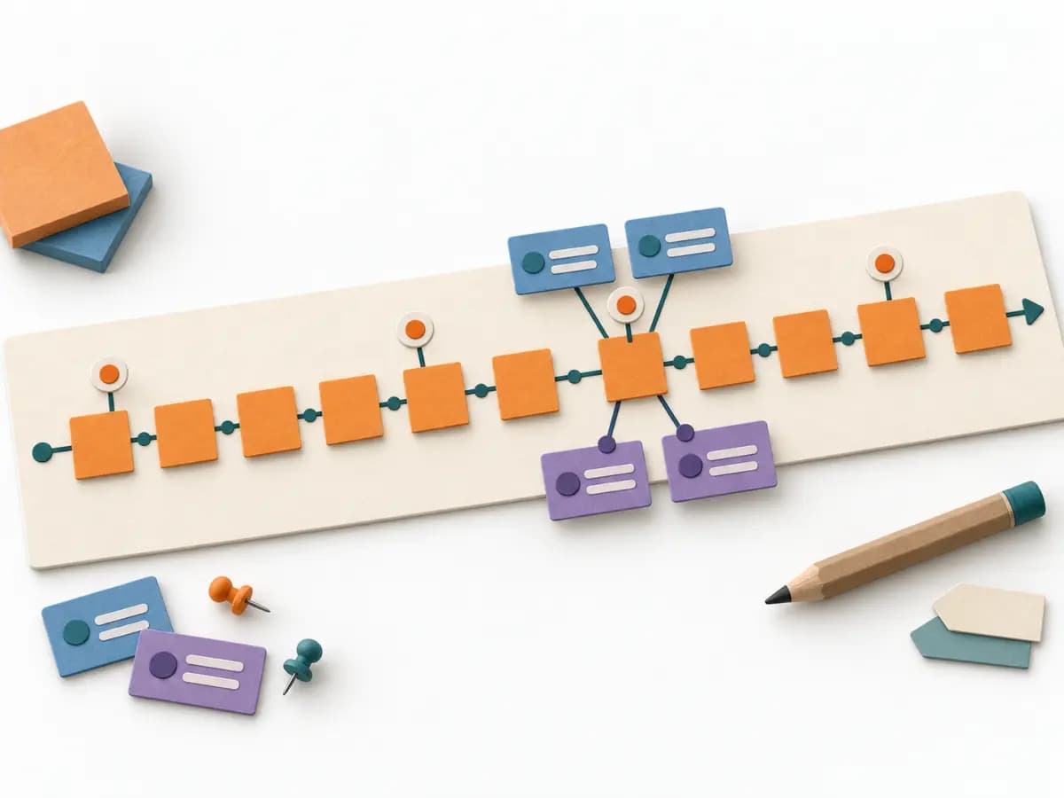 Domain Modeling EventStorming | 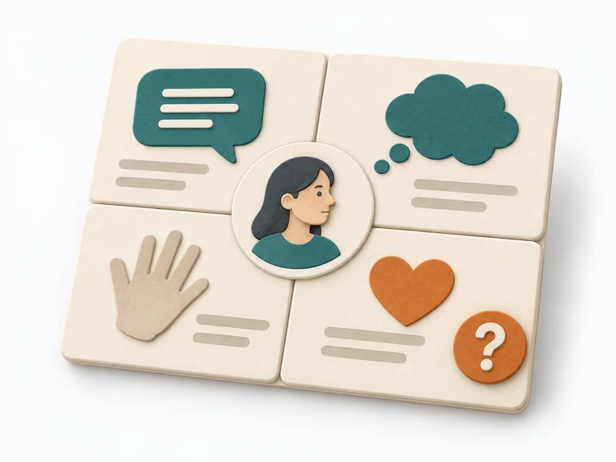 UX Research Empathy Mapping |
|---|---|---|---|---|
Purposedifferent | Event Modeling connects business workflows with commands, events, and views into one coherent mental model. It helps design behavior, UI, and technical slices from the same underlying logic. | When research notes, feedback, or observations sit unconnected side by side, affinity diagramming sorts the raw material into solid themes. Many individual points turn into patterns that make decisions and opportunities clearer. | When a domain consists of many events, rules, and states, it creates a shared modeling space for the team. It bundles language, flows, and boundaries before domain knowledge fragments into siloed views. | When a lot is assumed about a target group but little is seen jointly, empathy mapping makes knowledge and gaps directly comparable. The picture also shows which assumptions hold up and where evidence is missing. |
Complexitydifferent | Medium | Low | Medium | Low |
Timedifferent | 2-6 h | 45–90 min | 2-8 h | 30–60 min |
Participantsdifferent | 2-8 | 3-10 | 5-12 | 4-8 |
Formatdifferent | Workshop + async | Workshop | Workshop | Workshop |
Outputdifferent | Event Model, UI Flow, Commands, Read Models | Theme clusters, Insight statements, Opportunity areas | Event Timeline, Ubiquitous Language, Boundaries, Open Questions | Empathy Map, Assumptions List, Research Gaps |
Tagsno overlap | EventsBlueprintDomain-Driven DesignBehavior | SynthesisQualitativeRoot cause | Domain-Driven DesignEventsDiscoveryWorkshop | SynthesisQualitativeWorkshop |