View methods side by side.
Choose up to four methods. Add them using the search and share the comparison by copying its link.
| Criterion | 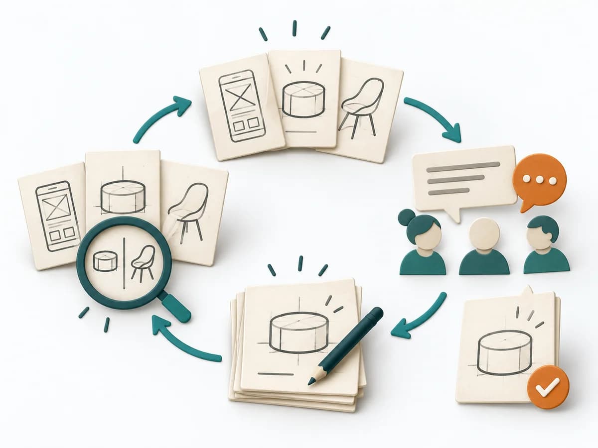 UX Design Design Studio | 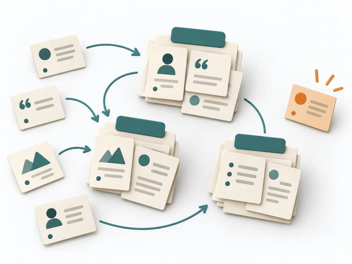 UX Research Affinity Diagramming | 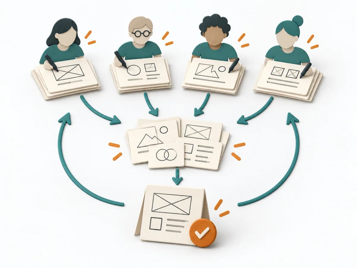 Innovation Design Charrette | 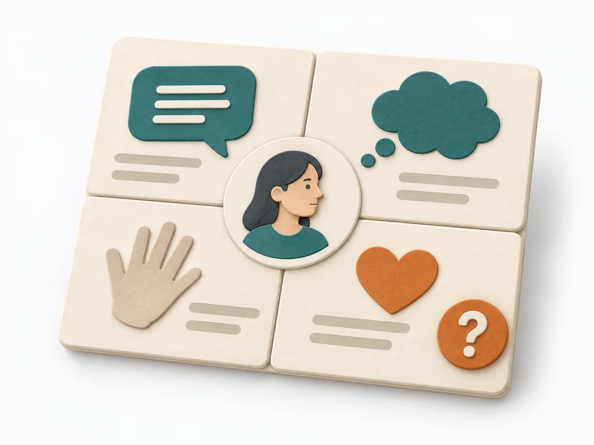 UX Research Empathy Mapping |
|---|---|---|---|---|
Purposedifferent | When several designs need to be quickly put in relation to each other, it makes ideas visible and comparable. It encourages early variants instead of long upfront debates. | When research notes, feedback, or observations sit unconnected side by side, affinity diagramming sorts the raw material into solid themes. Many individual points turn into patterns that make decisions and opportunities clearer. | In a tightly timed design process with many participants, the method pools several lines of thinking in a short time. It brings parallel design energy without letting the discussion tip into endless coordination. This quickly produces solid directions for architecture or space. | When a lot is assumed about a target group but little is seen jointly, empathy mapping makes knowledge and gaps directly comparable. The picture also shows which assumptions hold up and where evidence is missing. |
Complexitydifferent | Medium | Low | Medium | Low |
Timedifferent | 1-3 h | 45–90 min | Halber Tag bis mehrere Tage | 30–60 min |
Participantsdifferent | 3-8 | 3-10 | 10-50 | 4-8 |
Formatsame | Workshop | Workshop | Workshop | Workshop |
Outputdifferent | Sketches, Concept Directions, Design Decisions | Theme clusters, Insight statements, Opportunity areas | Sketches and Concepts, Consolidated Solution Sketch, Prioritized Direction | Empathy Map, Assumptions List, Research Gaps |
Tagsno overlap | SketchingCollaborationIdeation | SynthesisQualitativeRoot cause | BrainstormingWorkshopCollaborationIdeation | SynthesisQualitativeWorkshop |