View methods side by side.
Choose up to four methods. Add them using the search and share the comparison by copying its link.
| Criterion | 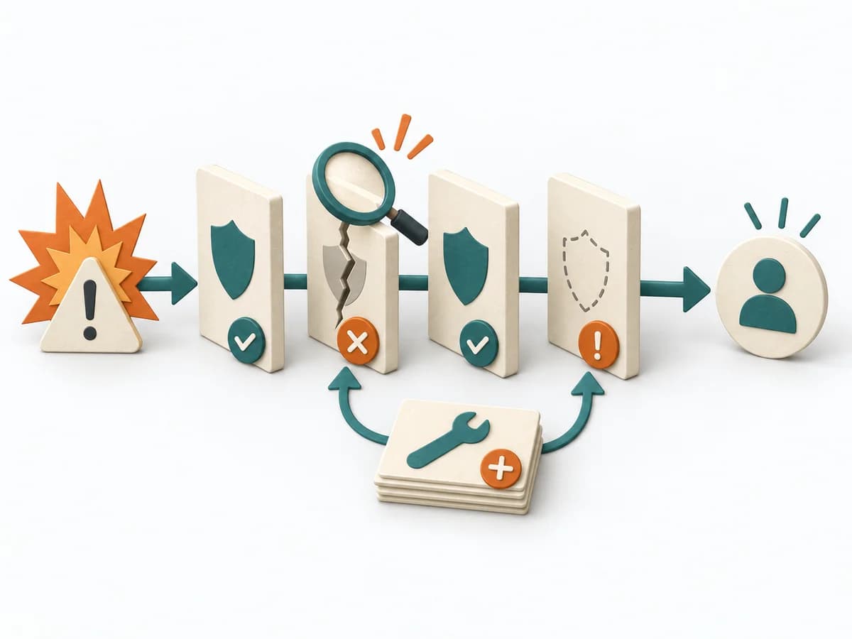 Operations Barrier Analysis |  UX Research Empathy Mapping | 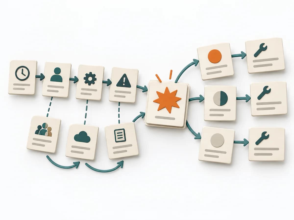 Operations Causal Factor Analysis | 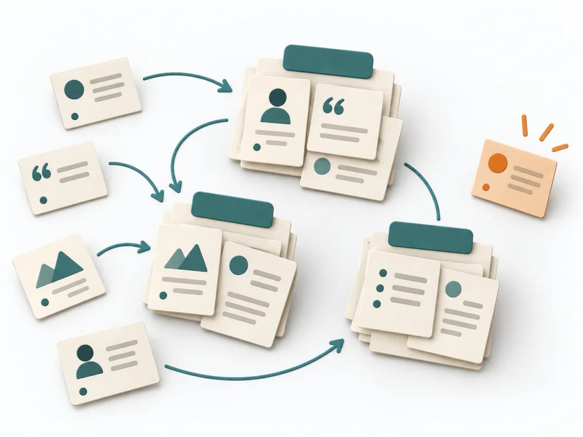 UX Research Affinity Diagramming |
|---|---|---|---|---|
Purposedifferent | For a risk that can only be managed through multiple layers of protection, the method examines the effectiveness of each barrier. It shows where safeguards are missing, too weak, or fail under real conditions. | When a lot is assumed about a target group but little is seen jointly, empathy mapping makes knowledge and gaps directly comparable. The picture also shows which assumptions hold up and where evidence is missing. | For an event with a complicated course, the method breaks down the contributing factors along the timeline. It shows how conditions, decisions, and reactions together produce a course of events. | When research notes, feedback, or observations sit unconnected side by side, affinity diagramming sorts the raw material into solid themes. Many individual points turn into patterns that make decisions and opportunities clearer. |
Complexitydifferent | Medium | Low | High | Low |
Timedifferent | 2-4 h | 30–60 min | 2-6 h | 45–90 min |
Participantsdifferent | 2-6 | 4-8 | 3-10 | 3-10 |
Formatdifferent | Workshop + async | Workshop | Workshop + async | Workshop |
Outputdifferent | Barrier Inventory, Failure Analysis per Barrier, Action Backlog | Empathy Map, Assumptions List, Research Gaps | Event Timeline, Causal Factor Chart, Cause List, Corrective Actions | Theme clusters, Insight statements, Opportunity areas |
Tagsno overlap | Root causeSafetyIncident | SynthesisQualitativeWorkshop | CausalityIncidentRoot causeTimeline | SynthesisQualitativeRoot cause |