View methods side by side.
Choose up to four methods. Add them using the search and share the comparison by copying its link.
| Criterion | 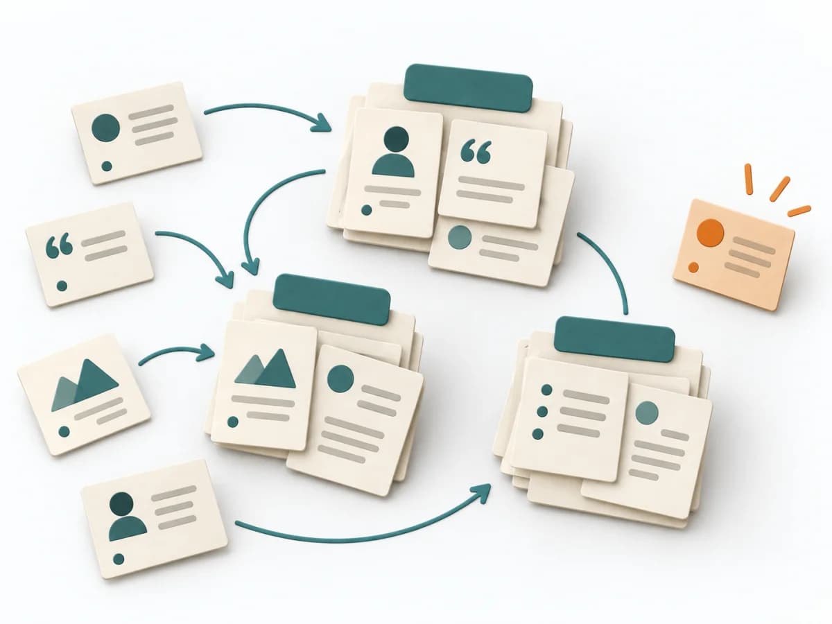 UX Research Affinity Diagramming | 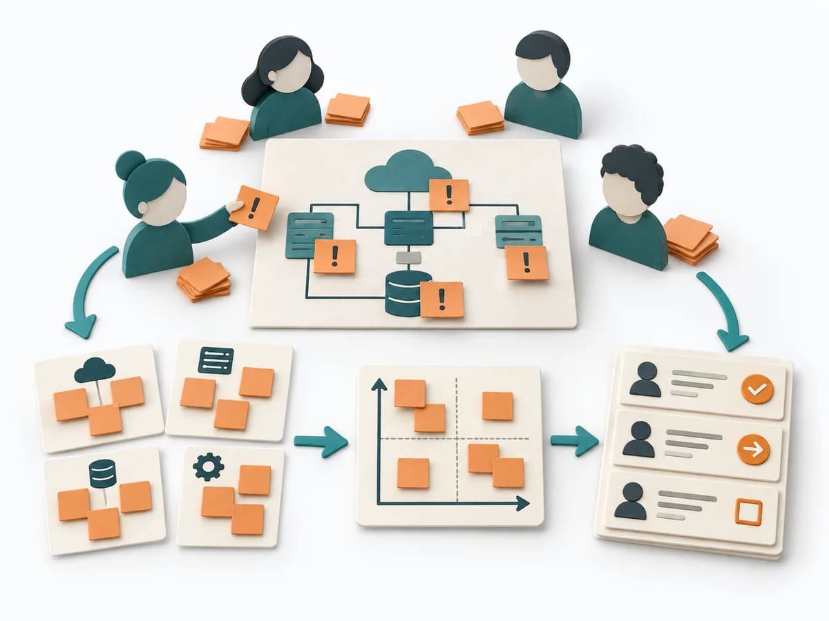 Architecture Risk Storming | 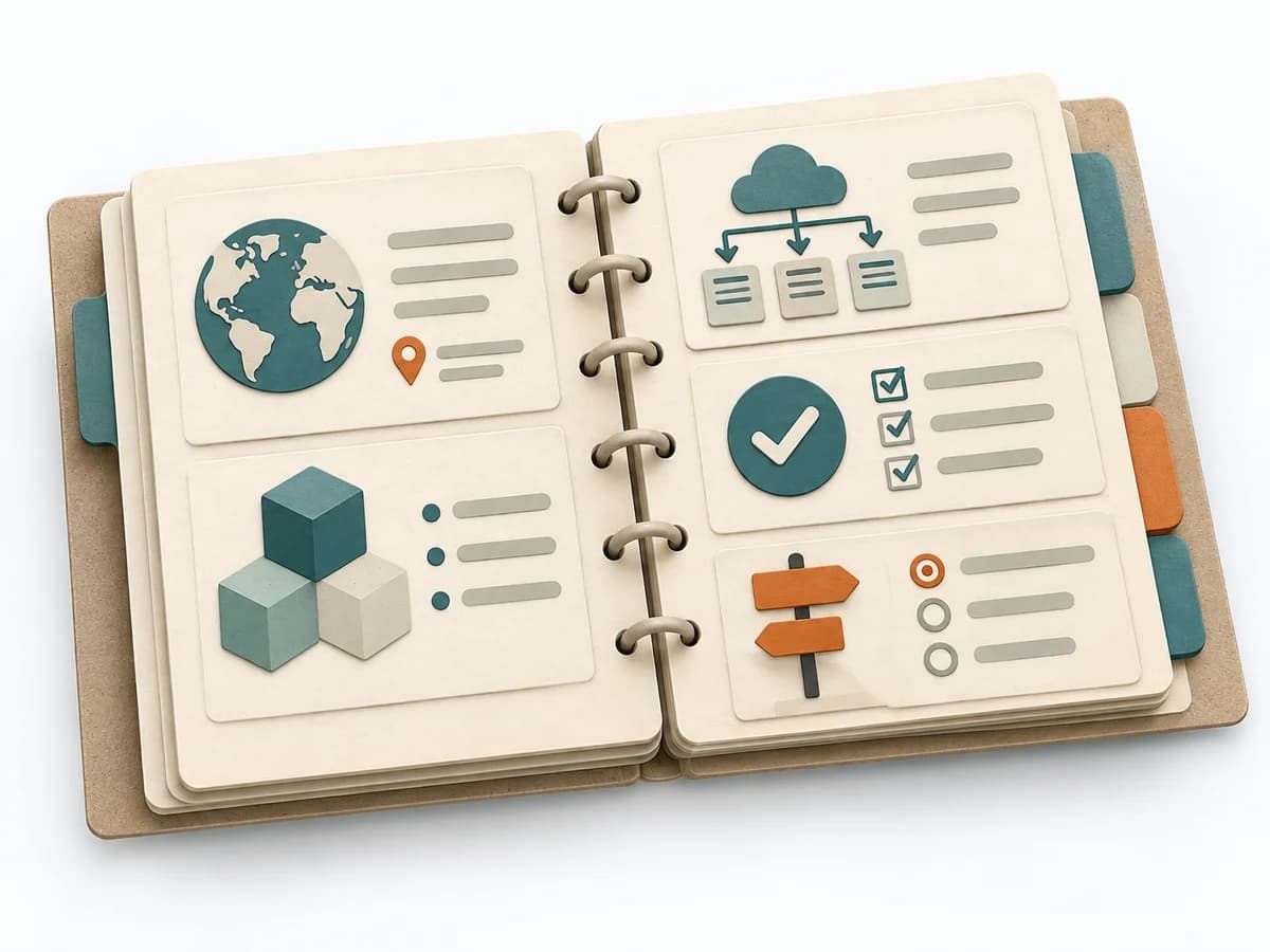 Architecture arc42 | 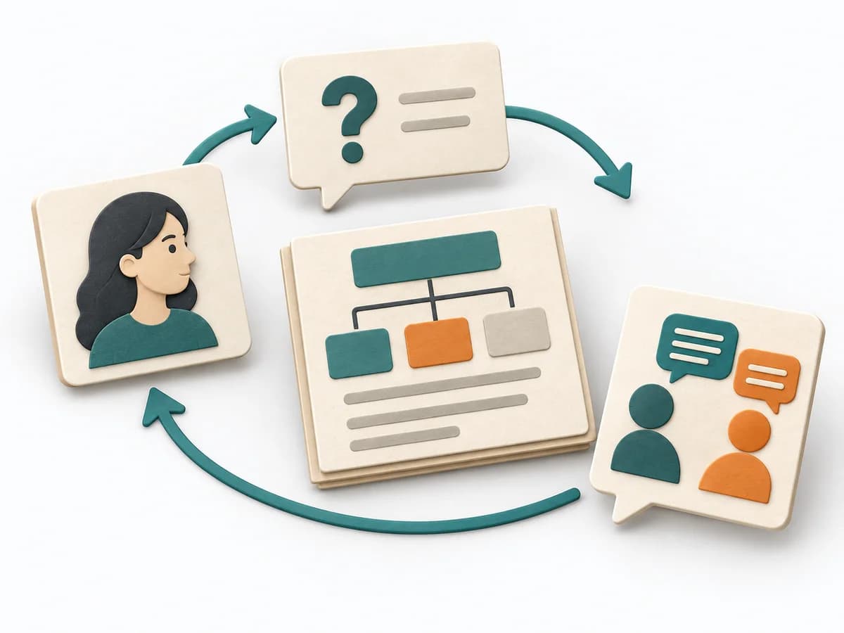 Architecture Architecture Communication Canvas |
|---|---|---|---|---|
Purposedifferent | When research notes, feedback, or observations sit unconnected side by side, affinity diagramming sorts the raw material into solid themes. Many individual points turn into patterns that make decisions and opportunities clearer. | Helps clarify architecture context, options, and consequences in concrete terms. It organizes technical context, alternatives, and consequences. The result is captured as an Annotated Diagram, a Prioritized Risk List, and an Action Backlog. | arc42 structures architecture knowledge so teams can document system, decisions, and risks consistently. The template builds a living understanding of the architecture instead of scattered notes. | The Architecture Communication Canvas plans architecture communication so the right people receive the right message. The method turns technical complexity into deliberate communication design. |
Complexitydifferent | Low | Low | Low | Medium |
Timedifferent | 45–90 min | 60-90 min | 1-2 Tage | 60-120 min |
Participantsdifferent | 3-10 | 4-12 | 1-4 | 2-8 |
Formatdifferent | Workshop | Workshop | Workshop + async | Workshop + async |
Outputdifferent | Theme clusters, Insight statements, Opportunity areas | Annotated Diagram, Prioritized Risk List, Action Backlog | Architecture Document, Context View, Runtime View, Deployment View | Communication Canvas, Stakeholder Messages, Architecture Communication Plan |
Tagsno overlap | SynthesisQualitativeRoot cause | RiskArchitectureWorkshopValidation | ArchitectureDocumentationCommunication | ArchitectureCommunicationStakeholdersCanvas |