View methods side by side.
Choose up to four methods. Add them using the search and share the comparison by copying its link.
| Criterion |  UX Research Affinity Diagramming | 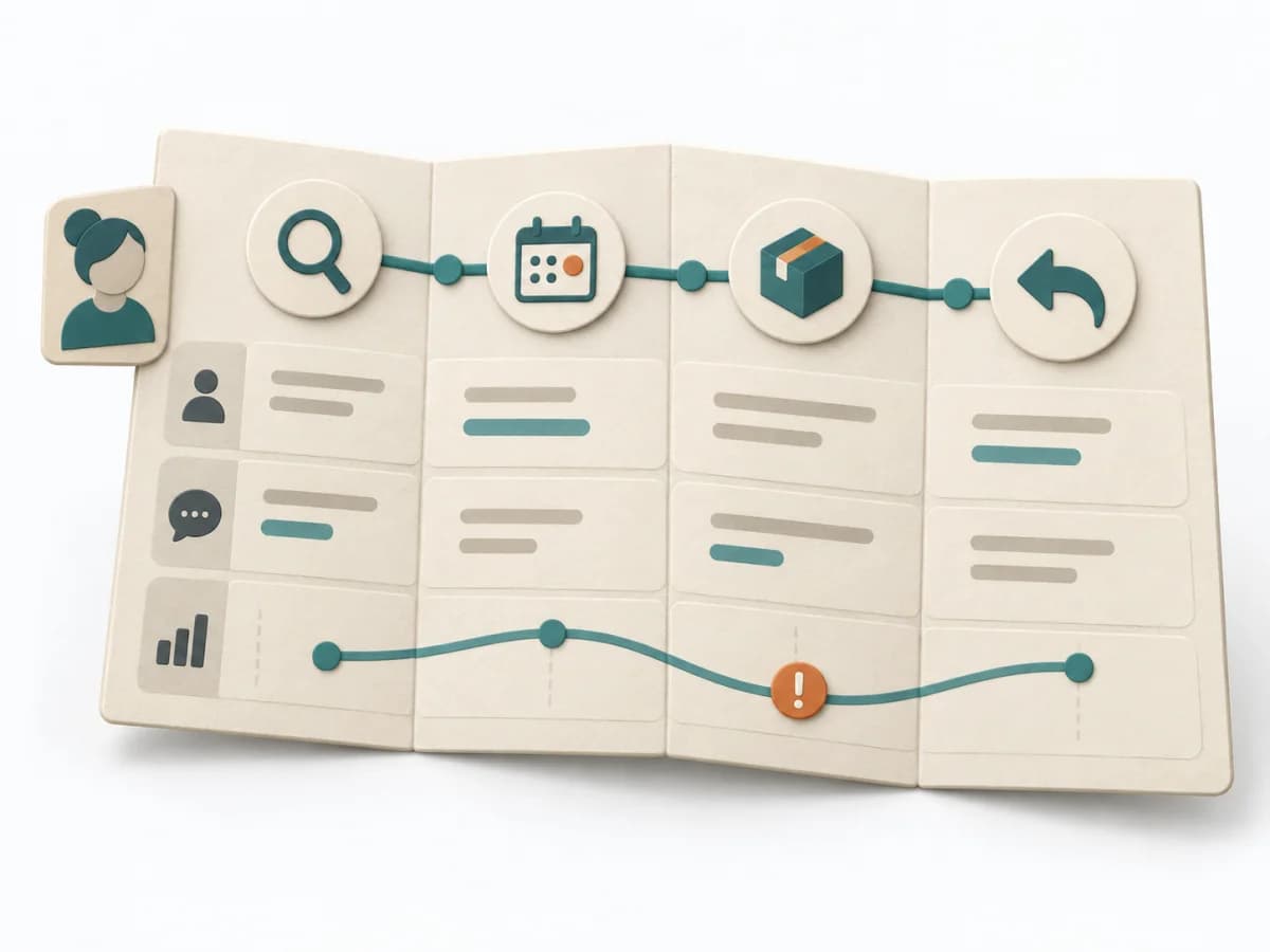 UX Research Customer Journey Mapping | 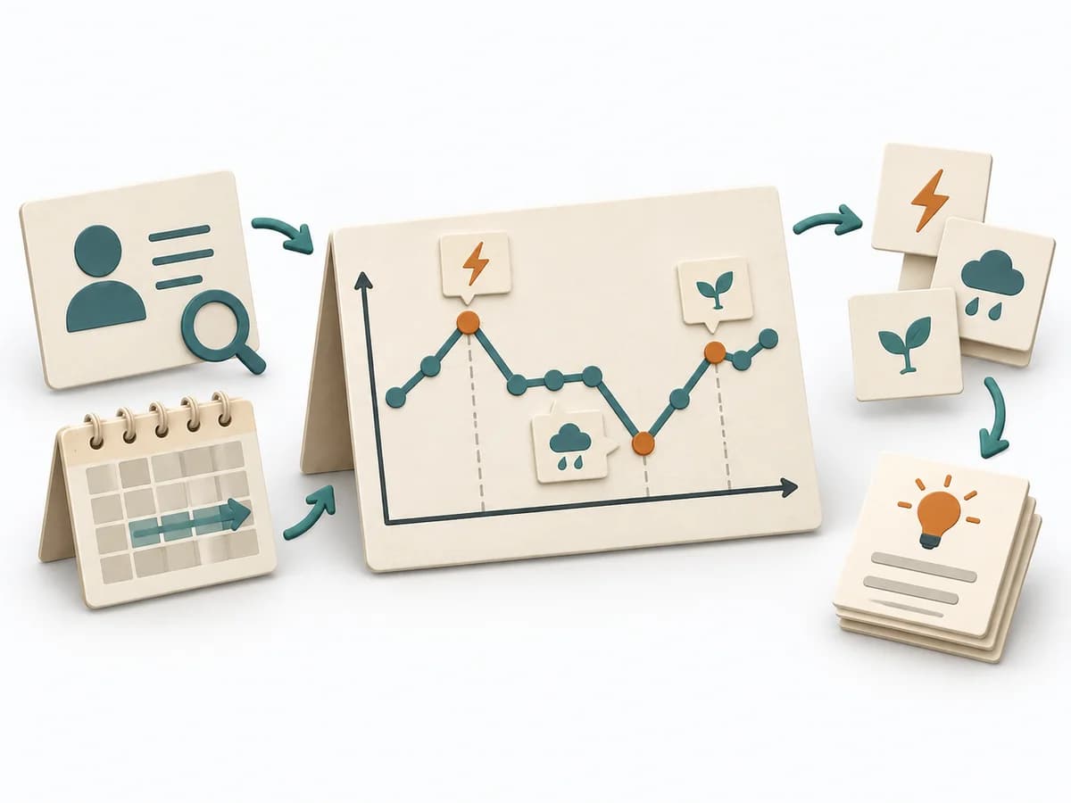 Systems Thinking Behavior Over Time Graph | 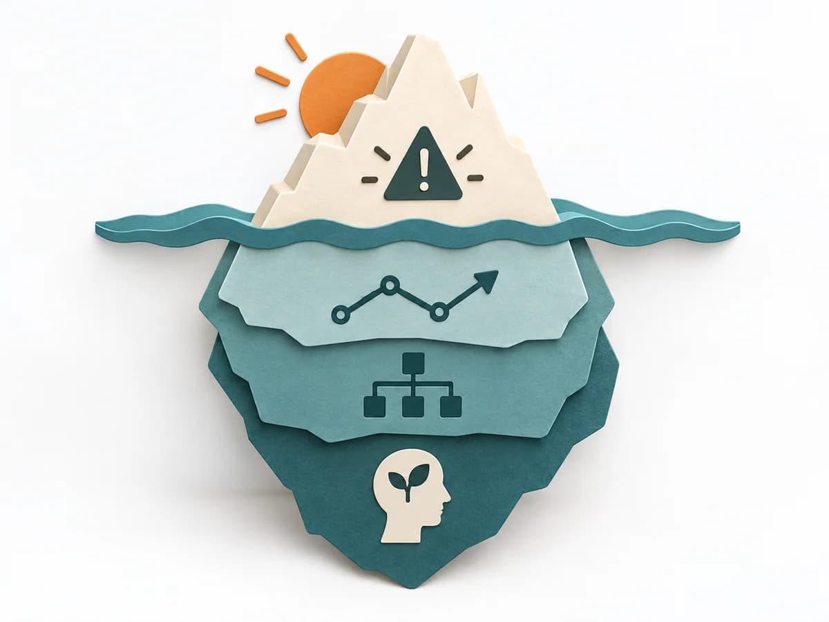 Systems Thinking Iceberg Model |
|---|---|---|---|---|
Purposedifferent | When research notes, feedback, or observations sit unconnected side by side, affinity diagramming sorts the raw material into solid themes. Many individual points turn into patterns that make decisions and opportunities clearer. | When a user journey falls apart across many touchpoints, customer journey mapping makes the experience visible as a coherent arc. Phases, emotions, and breaks become legible enough to prioritize critical moments deliberately. | A Behavior Over Time Graph shows how a metric or observation develops over time. The method makes trends, breaks, and recurring patterns visible that get lost in snapshots. | The Iceberg Model separates visible events from patterns, structures, and mental models. This turns a single observation into a deeper understanding of why a problem keeps recurring. |
Complexitydifferent | Low | Medium | Low | Low |
Timedifferent | 45–90 min | 2-4 h | 20-45 min | 30-60 min |
Participantsdifferent | 3-10 | 4-10 | 1-10 | 2-10 |
Formatdifferent | Workshop | Workshop | Workshop + async | Workshop + async |
Outputdifferent | Theme clusters, Insight statements, Opportunity areas | Journey Map, Pain-point List, Opportunity Backlog | Behavior Over Time Graph, Trend Hypotheses, Key Events | Iceberg Worksheet, Pattern Notes, Intervention Ideas |
Tagsno overlap | SynthesisQualitativeRoot cause | JourneyServiceService design | Systems thinkingPatternsDynamics | Systems thinkingRoot causePatterns |