View methods side by side.
Choose up to four methods. Add them using the search and share the comparison by copying its link.
| Criterion | 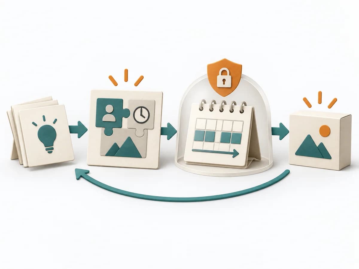 Delivery Shape Up |  UX Research Empathy Mapping | 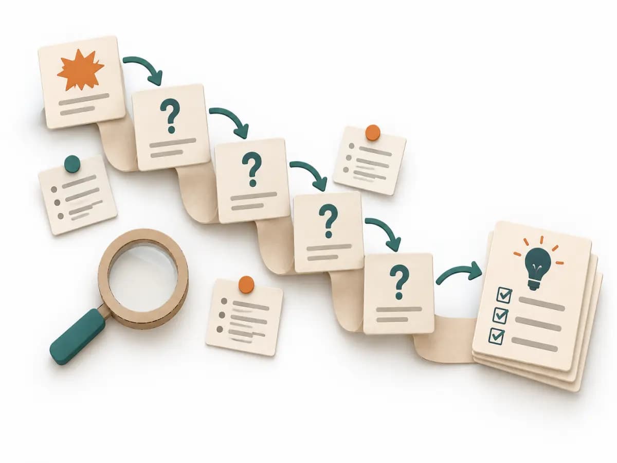 Operations 5 Whys | 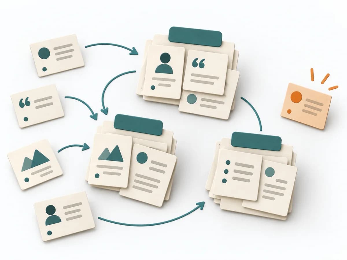 UX Research Affinity Diagramming |
|---|---|---|---|---|
Purposedifferent | Shape Up helps clarify scope, sequence, and delivery flow. It makes work boundaries and decisions explicit and captures results as pitches, bet-table decisions, and hill charts. | When a lot is assumed about a target group but little is seen jointly, empathy mapping makes knowledge and gaps directly comparable. The picture also shows which assumptions hold up and where evidence is missing. | For a single, hard-to-explain deviation, the method exposes the causal chain behind the visible symptom. It keeps the cause open until a controllable condition emerges instead of a mere description. | When research notes, feedback, or observations sit unconnected side by side, affinity diagramming sorts the raw material into solid themes. Many individual points turn into patterns that make decisions and opportunities clearer. |
Complexitydifferent | Medium | Low | Low | Low |
Timedifferent | 6 Wochen Cycle + 2 Wochen Cool-Down | 30–60 min | 15-30 min | 45–90 min |
Participantsdifferent | 2-4 pro Pitch | 4-8 | 2-6 | 3-10 |
Formatdifferent | Workshop + async | Workshop | Workshop | Workshop |
Outputdifferent | Pitches, Bet-table decisions, Hill charts, Cooldown outcomes | Empathy Map, Assumptions List, Research Gaps | Root cause notes, Countermeasures | Theme clusters, Insight statements, Opportunity areas |
Tagsno overlap | PlanningDeliveryAutonomy | SynthesisQualitativeWorkshop | Root causeIncidentLeanProblem solving | SynthesisQualitativeRoot cause |