View methods side by side.
Choose up to four methods. Add them using the search and share the comparison by copying its link.
| Criterion |  Operations Process Mapping | 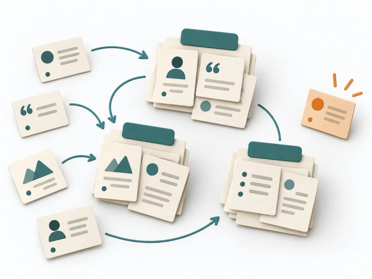 UX Research Affinity Diagramming | 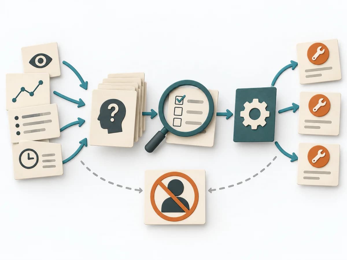 Operations Root Cause Analysis | 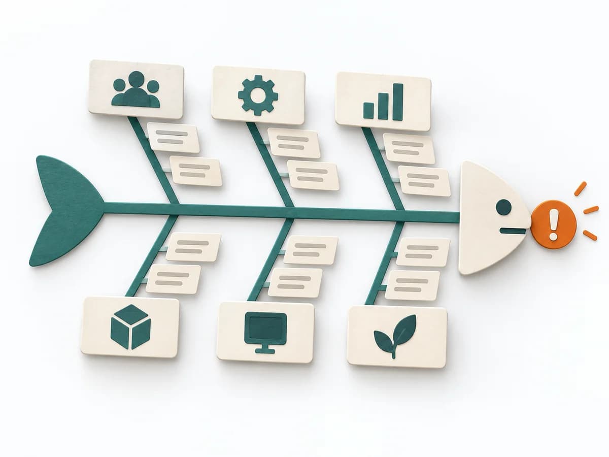 Operations Fishbone Diagram |
|---|---|---|---|---|
Purposedifferent | With a confusing workflow that has many handoffs, the method makes the actual process visible. It shows where work is passed on, delayed, or duplicated, so improvement targets the right spots. | When research notes, feedback, or observations sit unconnected side by side, affinity diagramming sorts the raw material into solid themes. Many individual points turn into patterns that make decisions and opportunities clearer. | When a problem keeps recurring and the cause stays unclear, the method exposes the underlying mechanism. It separates symptom, guess, and robust explanation from one another. | When a problem has several possible contributing factors, the method sorts causes by cause areas. It prevents an initial hunch from blocking the view of other plausible drivers. |
Complexitydifferent | Medium | Low | Medium | Low |
Timedifferent | 1-3 h | 45–90 min | 1-4 h | 30-60 min |
Participantsdifferent | 3-10 | 3-10 | 3-8 | 2-8 |
Formatdifferent | Workshop | Workshop | Workshop + async | Workshop |
Outputdifferent | Process Map, Handoff List, Improvement Backlog | Theme clusters, Insight statements, Opportunity areas | Problem Statement, Cause Hypotheses, Confirmed Causes, Action Plan | Fishbone Diagram, Cause Categories, Investigation Backlog |
Tagsno overlap | ProcessOperationsImprovement | SynthesisQualitativeRoot cause | Root causeProblem solvingQualityIncident | Root causeQualityOperations |