View methods side by side.
Choose up to four methods. Add them using the search and share the comparison by copying its link.
| Criterion | 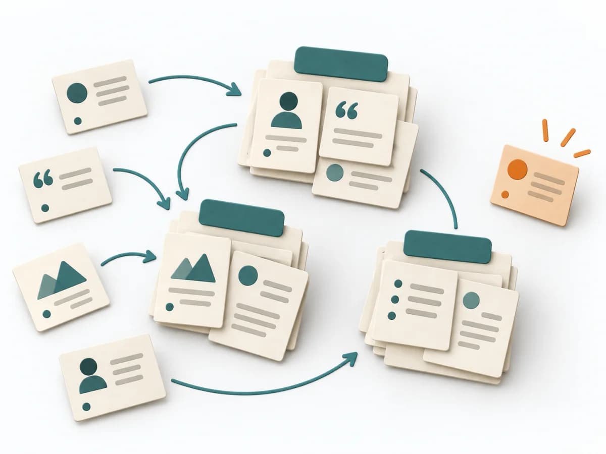 UX Research Affinity Diagramming | 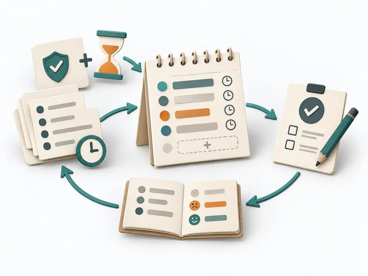 Operations ALPEN Method |  UX Research User Interviews | 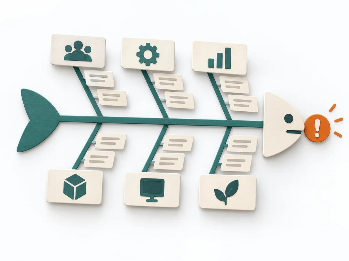 Operations Fishbone Diagram |
|---|---|---|---|---|
Purposedifferent | When research notes, feedback, or observations sit unconnected side by side, affinity diagramming sorts the raw material into solid themes. Many individual points turn into patterns that make decisions and opportunities clearer. | With an overloaded day full of too many tasks, a realistic picture of the day emerges. The method connects estimating, deciding, and buffer thinking so planning fits available energy and time. | When teams derive needs only from assumptions and real motives are missing, user interviews give direct access to behavior and meaning. Conversations from the target group's everyday life make patterns, tensions, and open questions solidly visible. | When a problem has several possible contributing factors, the method sorts causes by cause areas. It prevents an initial hunch from blocking the view of other plausible drivers. |
Complexitysame | Low | Low | Low | Low |
Timedifferent | 45–90 min | 10-20 min daily | 30–60 min per interview | 30-60 min |
Participantsdifferent | 3-10 | 1 | 1 participant per interview | 2-8 |
Formatdifferent | Workshop | Async | Workshop + async | Workshop |
Outputdifferent | Theme clusters, Insight statements, Opportunity areas | Daily Plan, Time Estimates, Review Notes | Interview Notes, Themes, Insight Summary | Fishbone Diagram, Cause Categories, Investigation Backlog |
Tagsno overlap | SynthesisQualitativeRoot cause | PlanningTime managementProductivityOperations | QualitativeResearchCustomerDiscovery | Root causeQualityOperations |