View methods side by side.
Choose up to four methods. Add them using the search and share the comparison by copying its link.
| Criterion | 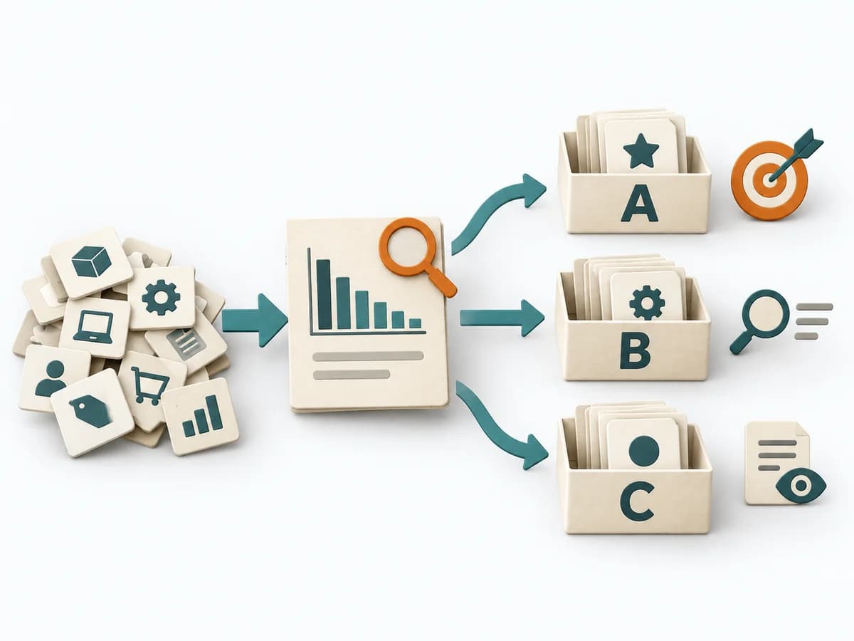 Operations ABC Analysis |  UX Research Personas | 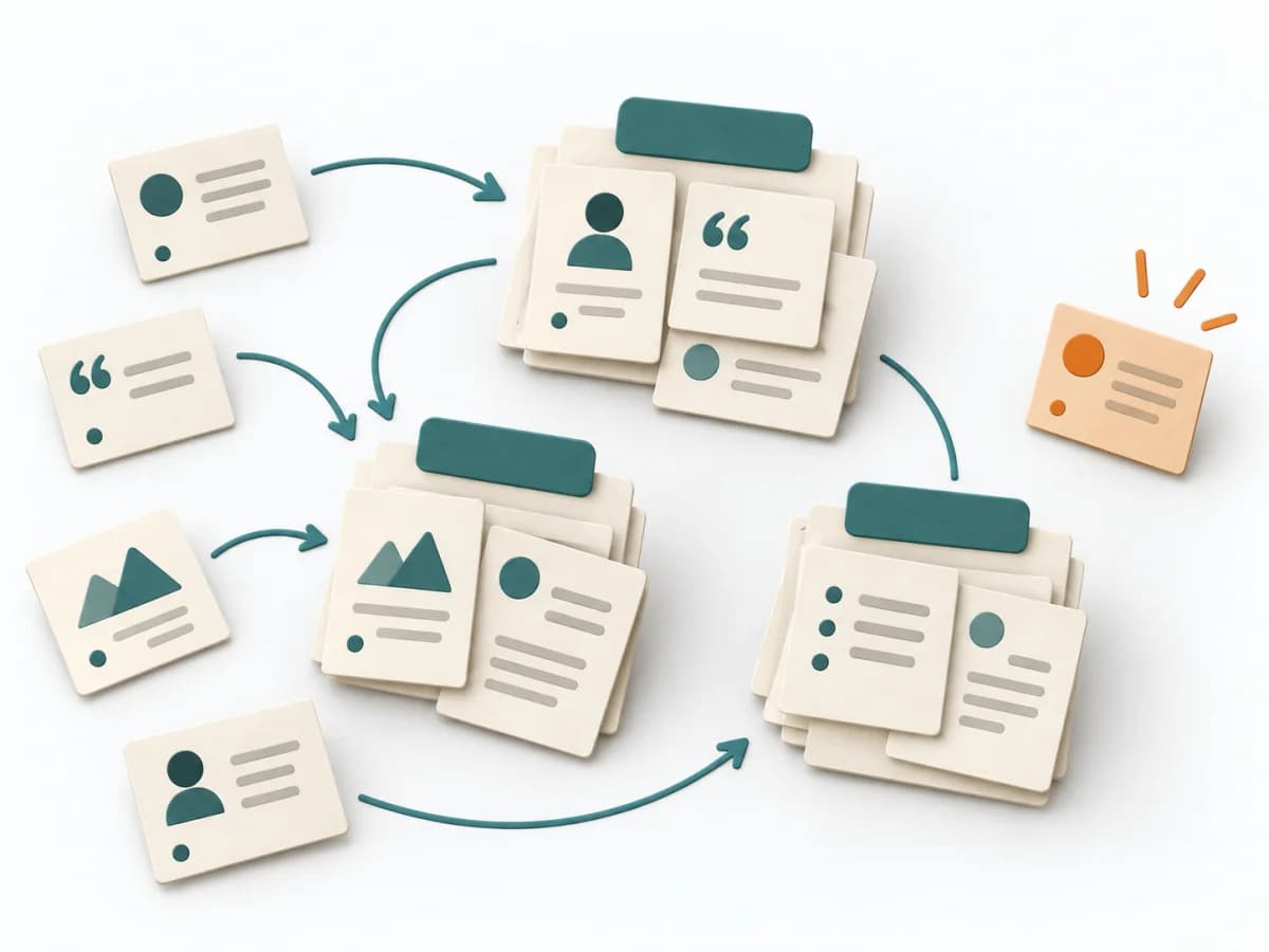 UX Research Affinity Diagramming | 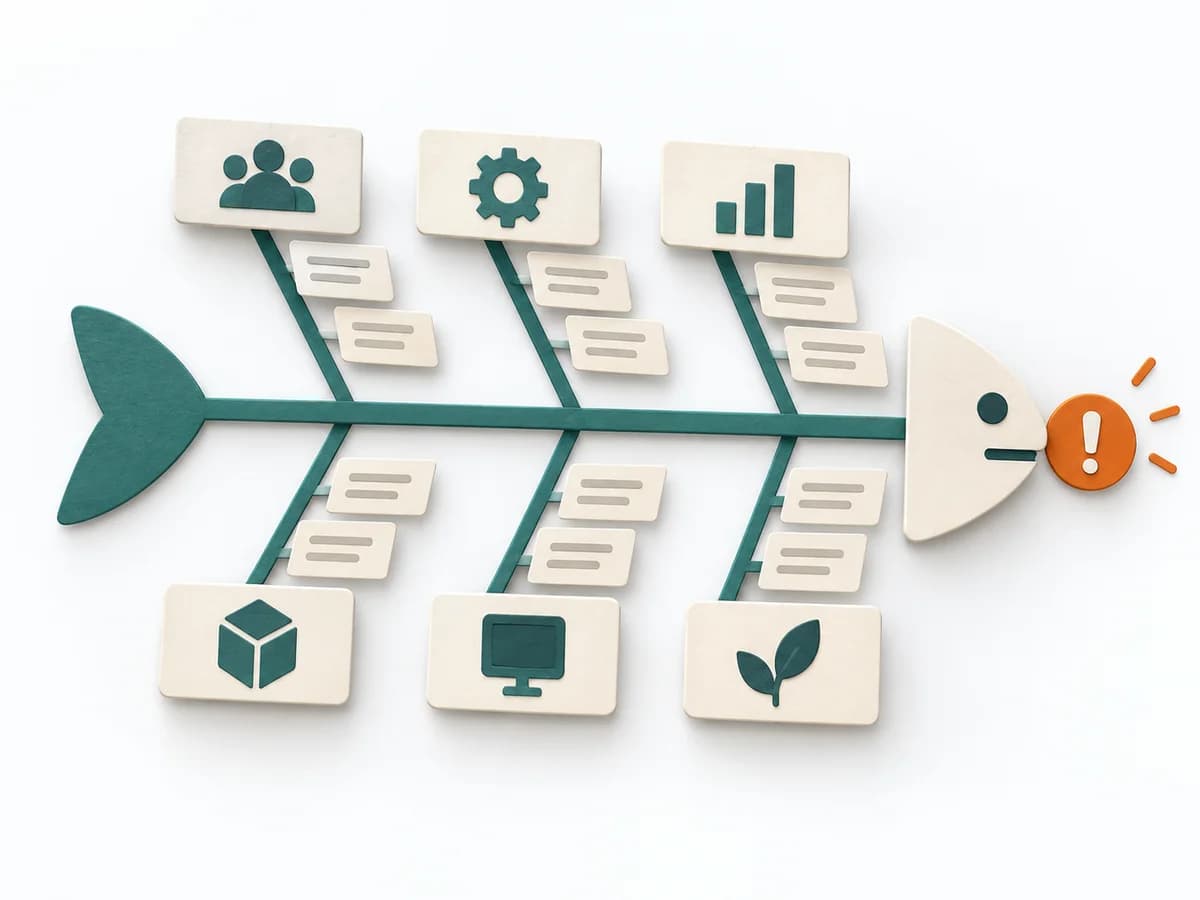 Operations Fishbone Diagram |
|---|---|---|---|---|
Purposedifferent | With many similar objects of differing economic significance, the method prioritizes effort by effect. It separates what needs regular steering from what rarely needs attention. | When target groups stay too vague and teams talk about the same people differently, personas create a shared, solid picture of usage. Condensed profiles make needs, contexts, and differences tangible enough for decisions. | When research notes, feedback, or observations sit unconnected side by side, affinity diagramming sorts the raw material into solid themes. Many individual points turn into patterns that make decisions and opportunities clearer. | When a problem has several possible contributing factors, the method sorts causes by cause areas. It prevents an initial hunch from blocking the view of other plausible drivers. |
Complexitydifferent | Low | Medium | Low | Low |
Timedifferent | 30-60 min | 1-3 Tage | 45–90 min | 30-60 min |
Participantsdifferent | 1-5 | Internes Team | 3-10 | 2-8 |
Formatdifferent | Async | Workshop + async | Workshop | Workshop |
Outputdifferent | ABC Classification, Focus Rules, Control List | Persona Profiles, Needs Summary, Scenario Notes | Theme clusters, Insight statements, Opportunity areas | Fishbone Diagram, Cause Categories, Investigation Backlog |
Tagsno overlap | PrioritizationOperationsPortfolio | ResearchCustomerSynthesis | SynthesisQualitativeRoot cause | Root causeQualityOperations |